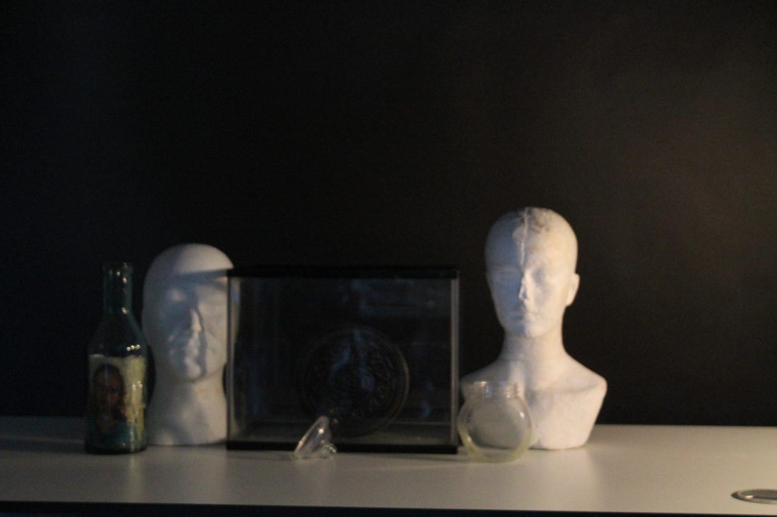
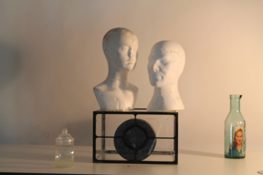
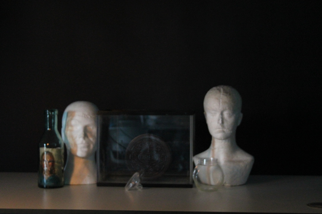
Chiaroscuro
chiaroscuro mean dark and light in Italian its used in types of art to contrast colours most likely used on bold colours have a good affect on the composition, and also their is a technical term for it used my art historians and famous artists. Their is also a chiaroscuro woodcut for different kinds of coloured types of woodcut printed for different types of books.
|
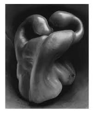
Edward Weston
this photo from Edward weston of the pepper is a good photo because this photo is simple and intriguing the pepper is the main and only object in this photo. The light in this photo is coming from the top right corner witch covers the whole of the front of the pepper and leave the back ground pitch black and to me this photo sends a message of equality and difference because the pepper looks like to people combined as one thing just light and dark they are the sam thing but very different also at the same time the compassion of the pepper. |
|
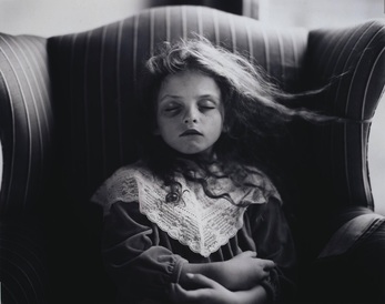
Sally Mann
I chose this photo from sally man because the little girl in the photo looks strange and also the movement of her hair make he look scary, the mood in this photo is a dead sort of mood because their is nothing going on in the photo such as the girl is the main part of the photo their is nothing going on in the back ground or foreground and also the darkness in the chair makes her look dead. The movement of this girl is very little because the only movement in this photo is the girls hair getting blown, the light in this photo is quite minimal it looks like the light is coming from natural day light like it is from a window but the light is coming from behind her so its only at the top of the chair and her head. the darkness in this photo is the most important bit because it give the person who is looking at it an emotion a thought of why the photographer took the photo like this and what she wanted to achieve like giving of the feeling of being dead and a strange but wonderful spin on it. |
|
|
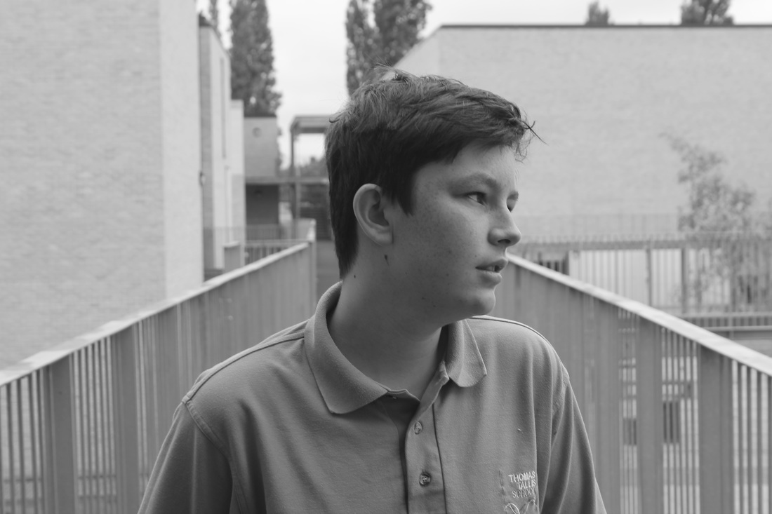
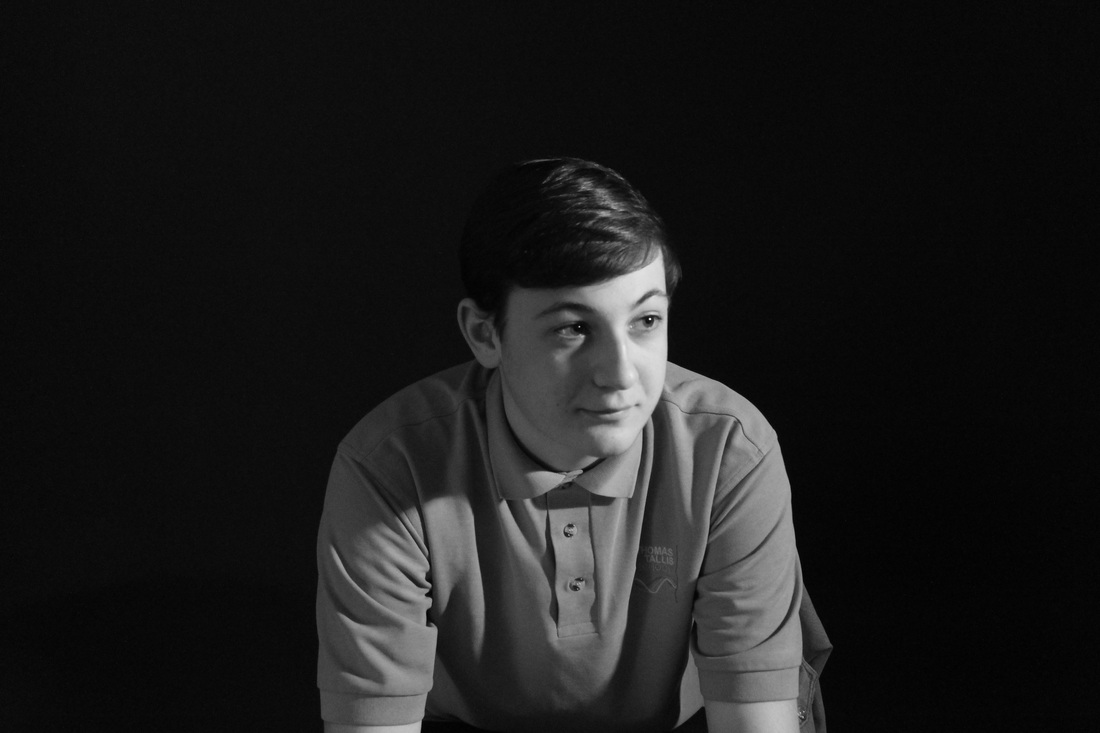
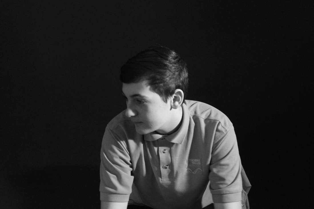
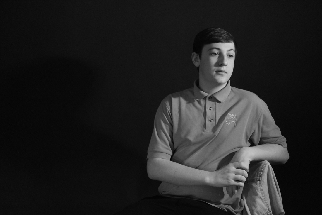
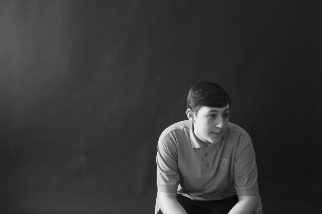
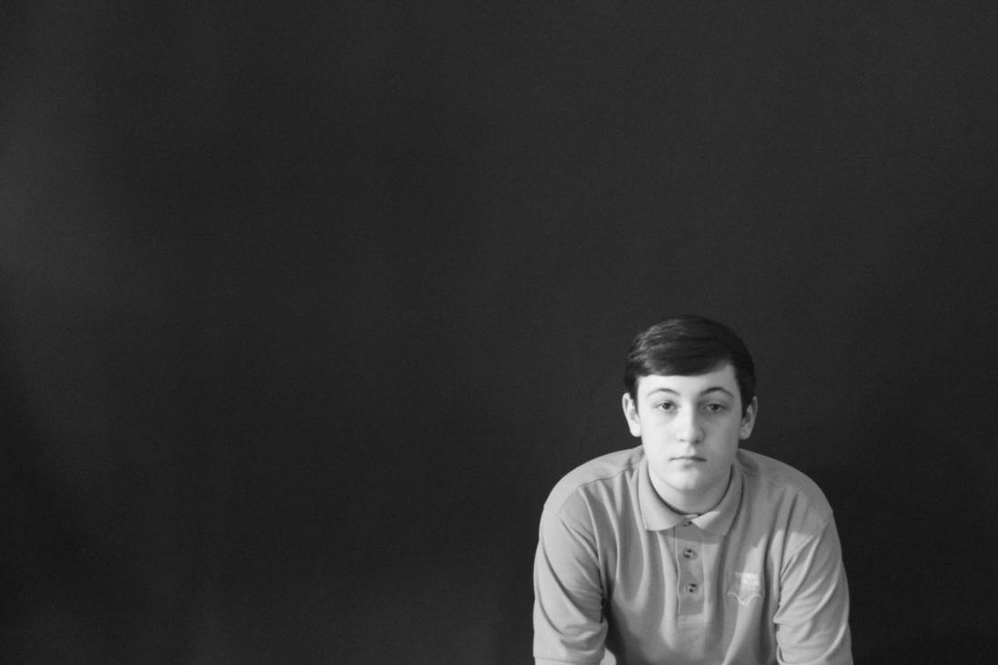
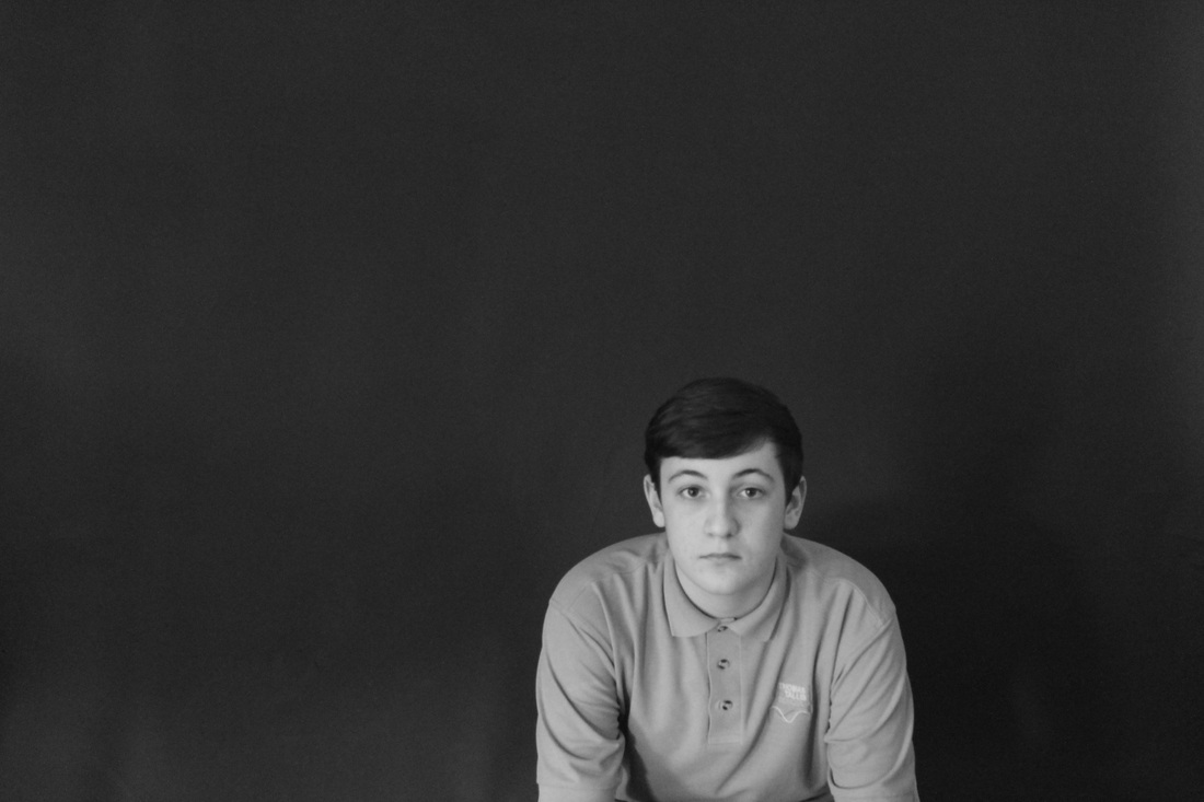
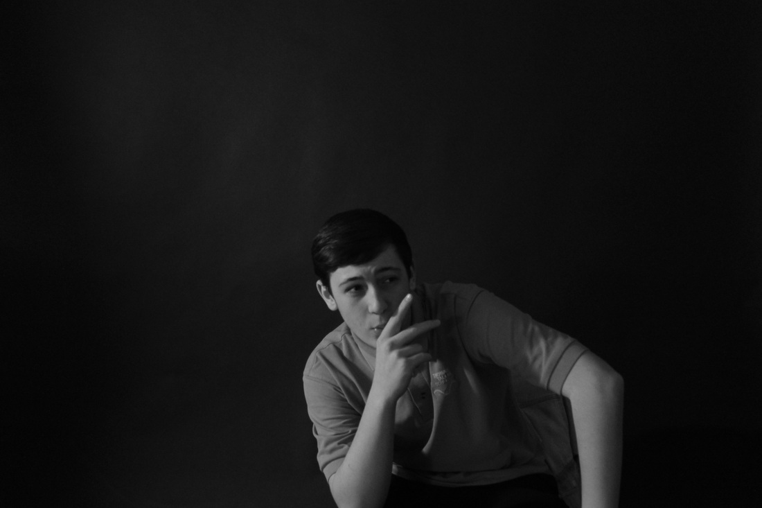
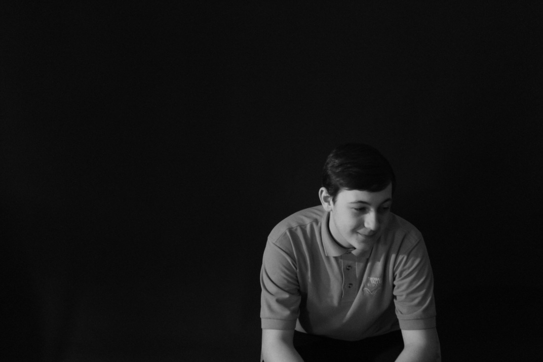
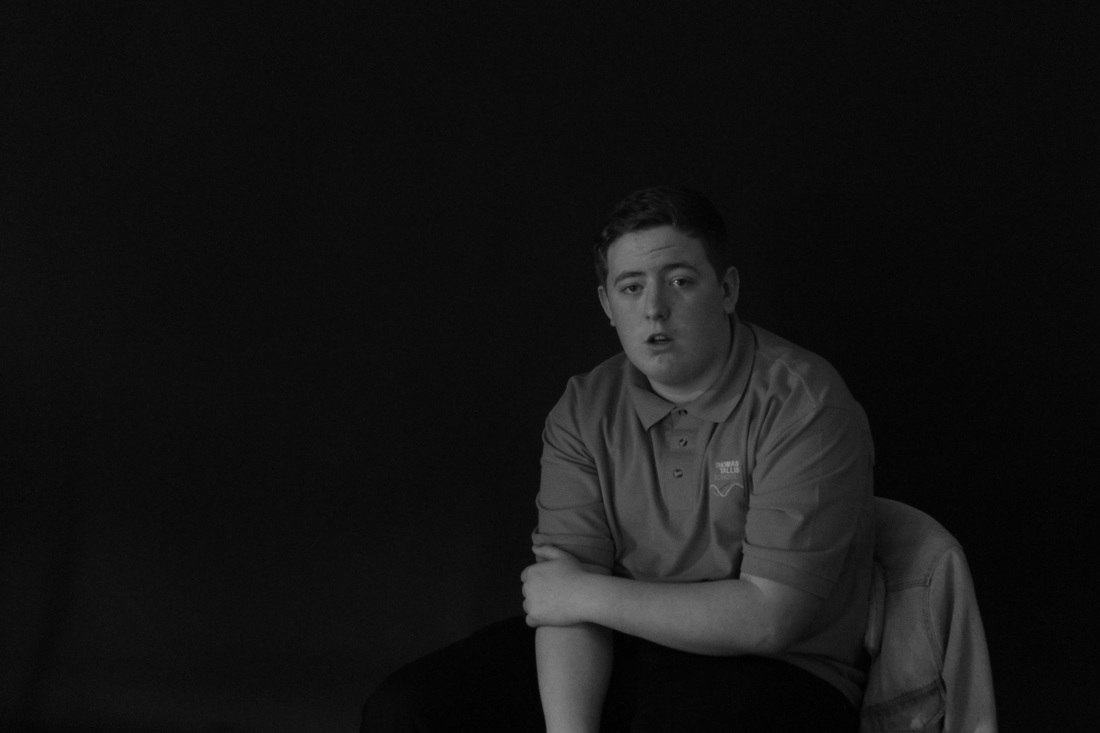
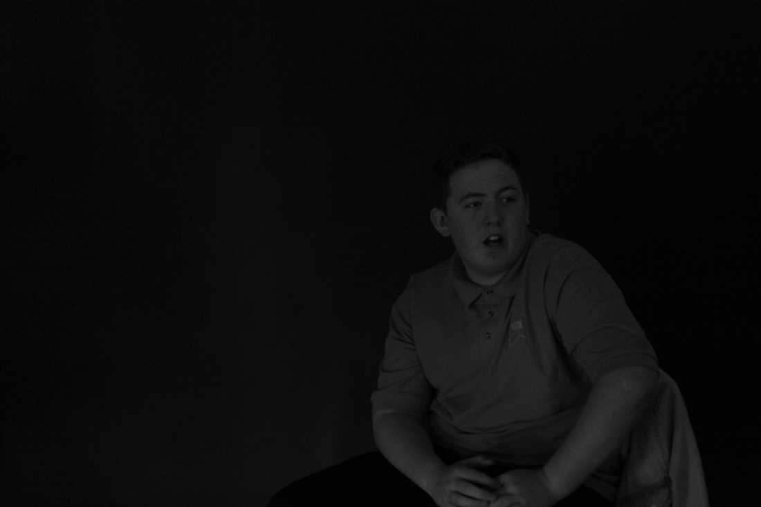
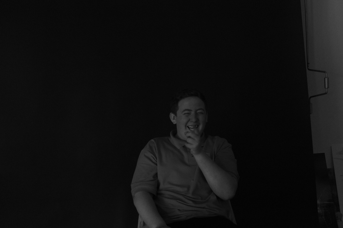
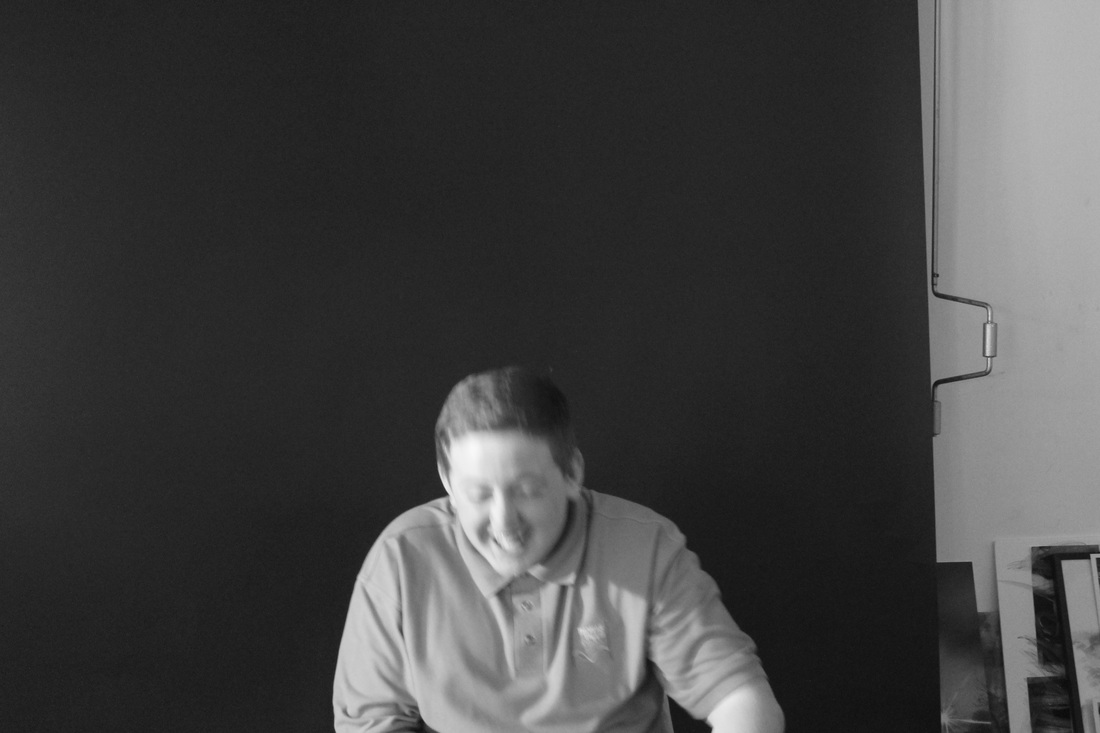
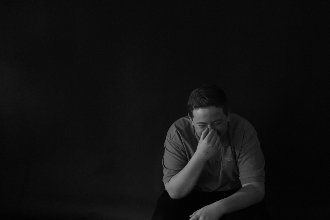
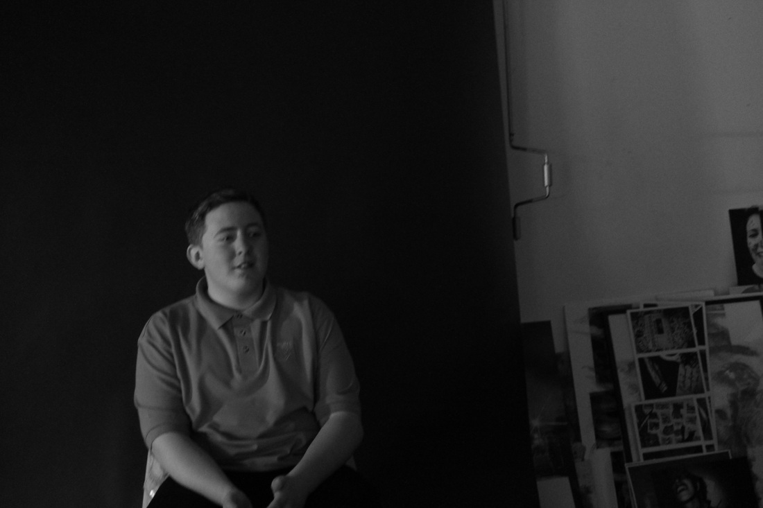
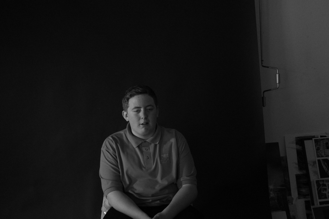
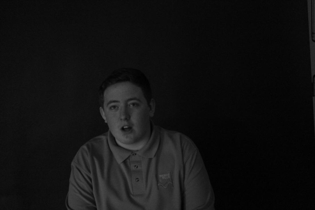
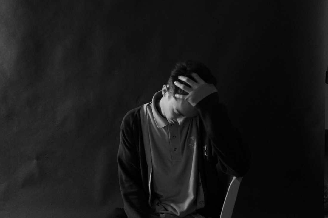
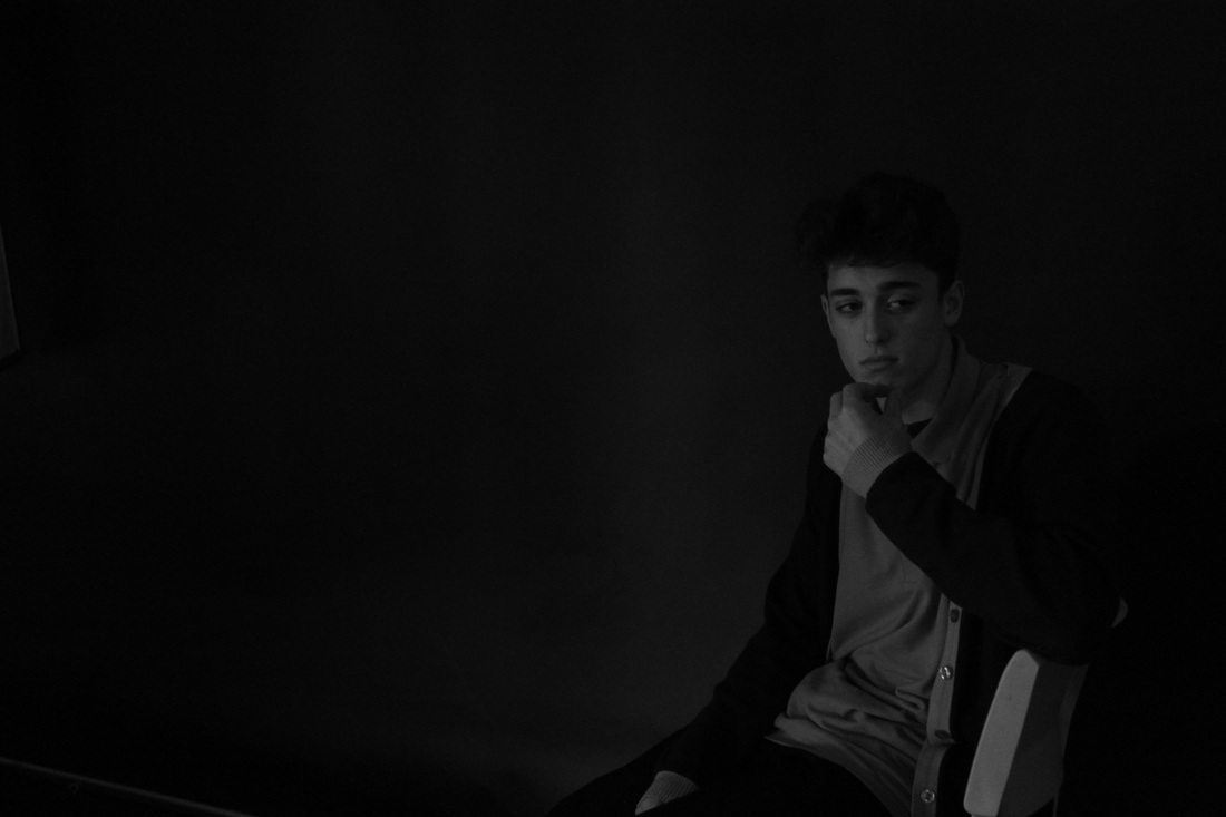
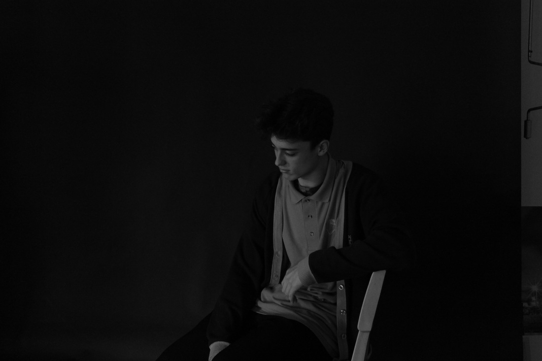
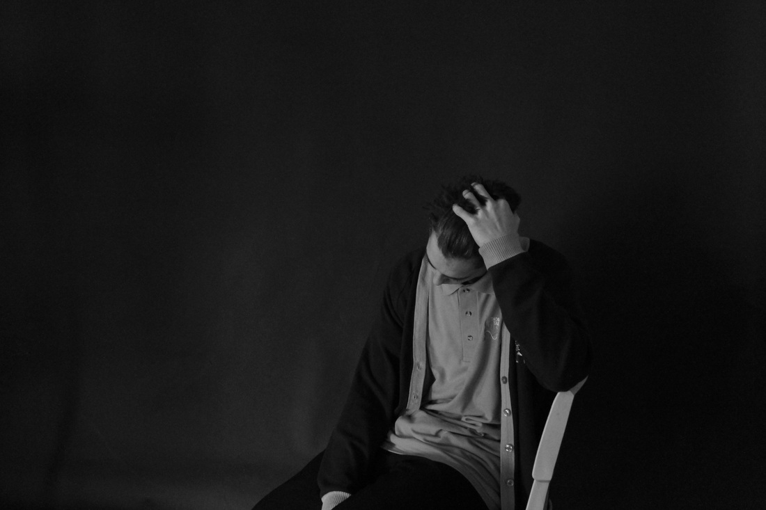
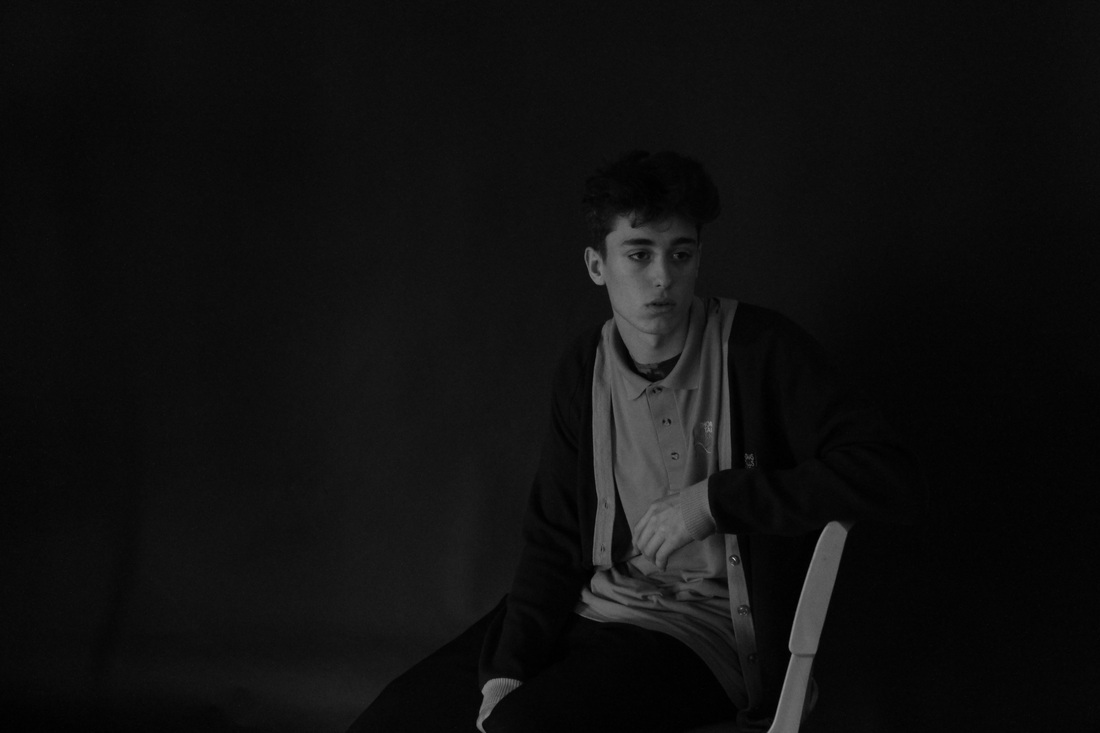
W.W.W- I think the one of brandon went well because the way the composition is, brandon is quite central which makes it easier to focus on the him. The lighting was not natural daylight we focused it on his upper body like his hand and his head egt,
E.B.I- the first one didn't go as well as the others because the angle of the camera is to far to the right and the lighting is brighter in the right corner instead of being focussed on the person if i was to improve it i would would move the camera to make it more central and have the light shining up from the back, this would make the photo better because the part we was supposed to focus on we didn't. |


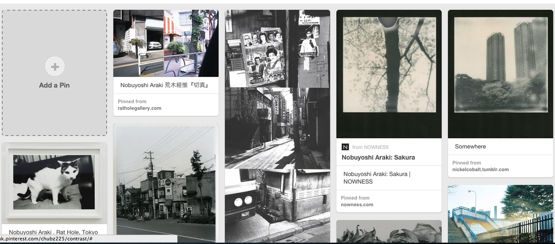
This photo from Nobuyoshi araki focusses on a cat standing on the sofa i like this photo because its very subtle and simple but is eye gazing the lighting in the photo exposes the whitens of the cats fur and also the blackness of his eyes it has a good depth of filed because in the back round the lever sofa is blurred out and the cat is in focusses the texture of tis photo is very smooth and warming, the thing that i like about this photo the most is that the shape of the cat stands out to everything in the image.
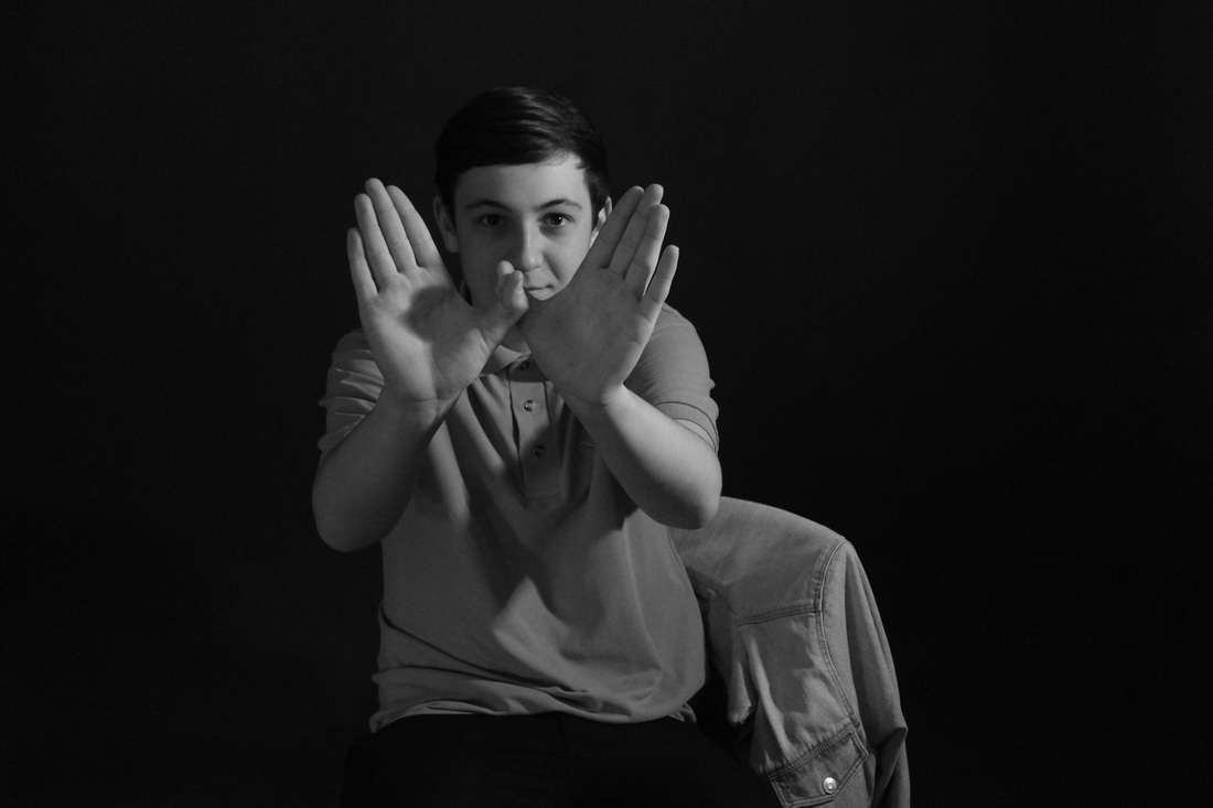
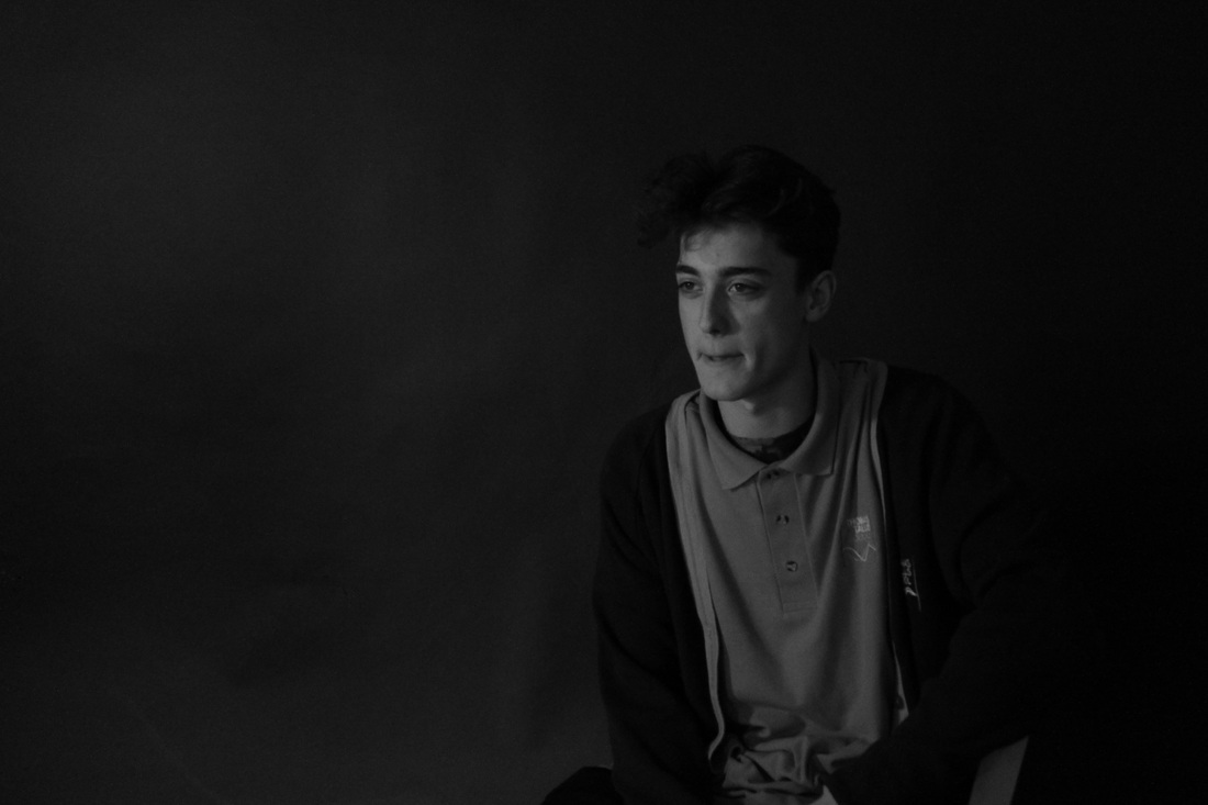
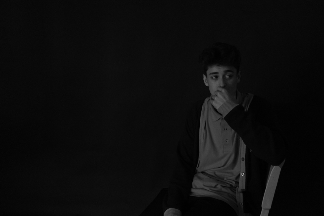
W.W.W- i think the lighting in these photos went well because the light isn't over exposing but is also isn't under exposed where you cant see it i also like the way i have positioned them because they are very central and in some of the photos there is levels of hight the texture of the light is smooth its not a hard light its quite soft the angles of the camera are very similar but i think it makes it more easier to focus on
E.B.I- i think i c
E.B.I- i think i c
EVALUATION
the light in these photos have all came from natural day light i prefer natural day light on these photos because the black and white effect i used mixed with the day light makes the whites more exposed so the contrast stands out more. the dark in this photo stands out but not as much as the light but puts on the effect of dullness and simplicity. In my photos there is no movement i decided to take landscape photos because i wanted to have the same style as Nobuyoshi araki and also using exposer of light. The composition of all of my photos are quite similar in the way i have angled my photos and positioned myself .
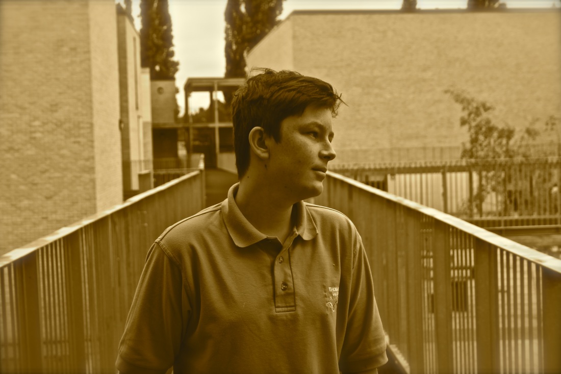
With these photos I wanted to capture light in a contras sort of way were it would be over expose and under exposed on some photos then on others quite a neutral way, This was the first experiment using a digital camera outside to try to capture light and i think it went well and i'm am confident with this photos but i could improve it buy using different angles and different styles to change my prospective on some photos, I think I was most successful with the first photograph because i changed the angle of the photo compared to my others and made it a neutral with lighting and the way that i composed it i found was good because i put the person in the middled of the photo and i took it with out him knowing so it was a natural photo, he light in the photo was al natural lighting.
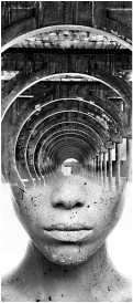
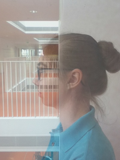
Antonio Mora is a creative art director he uses half of a persons face a blends it with a photo of nature or buildings like trees or churches and he also uses mountains his work inspired me to have ago at blending two different images and see if they could work as one image. The image is not ordered but not busy
BLEND APP

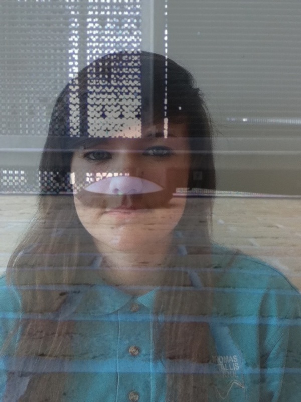
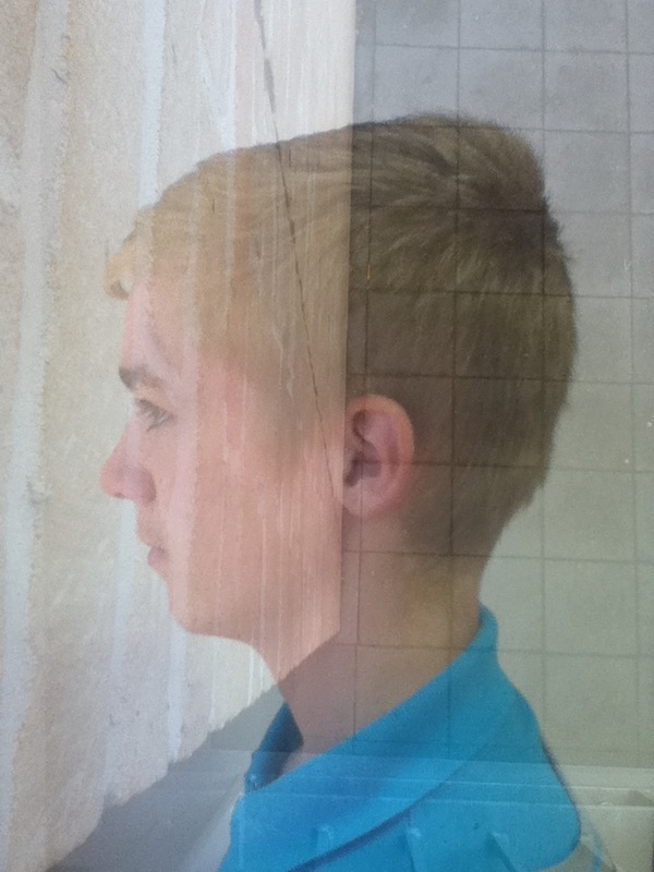
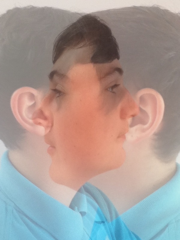
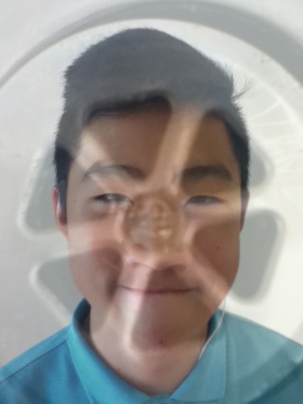
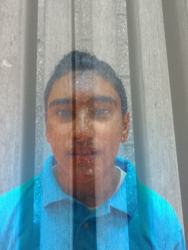
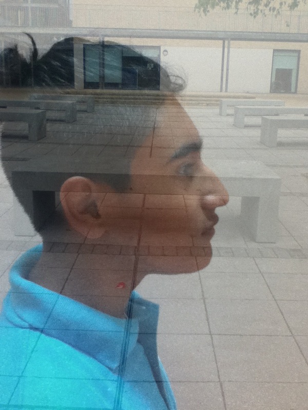
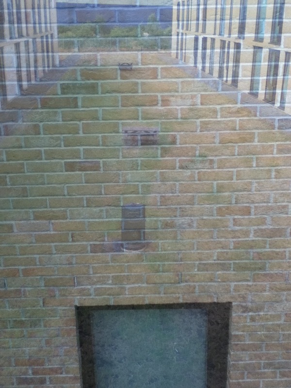
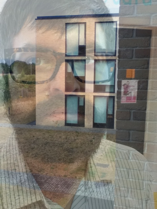
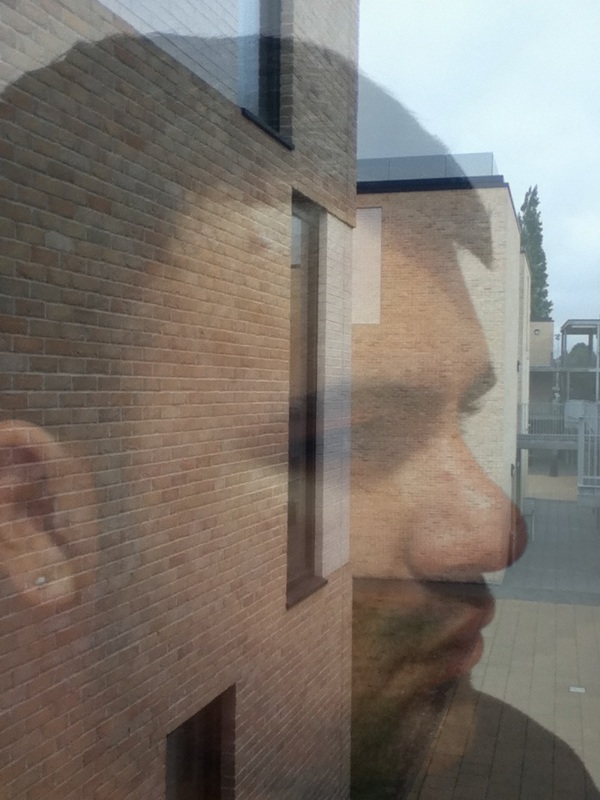
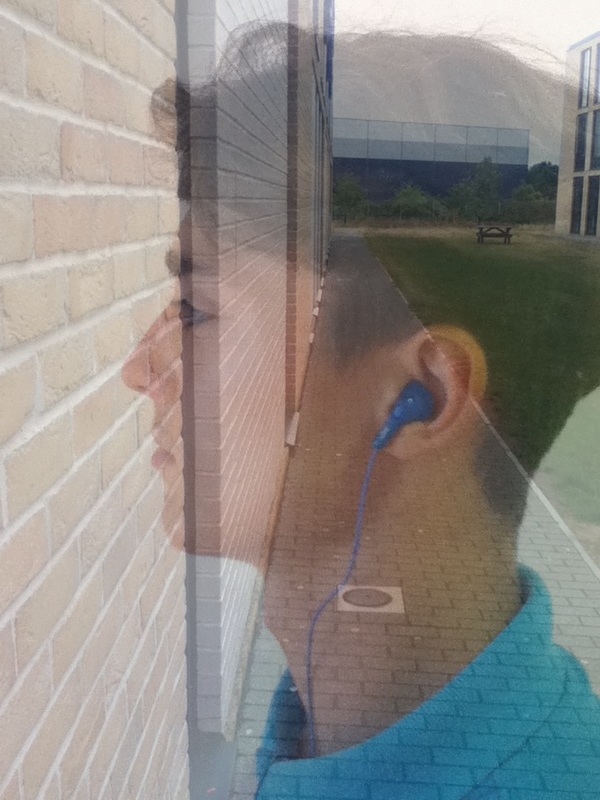
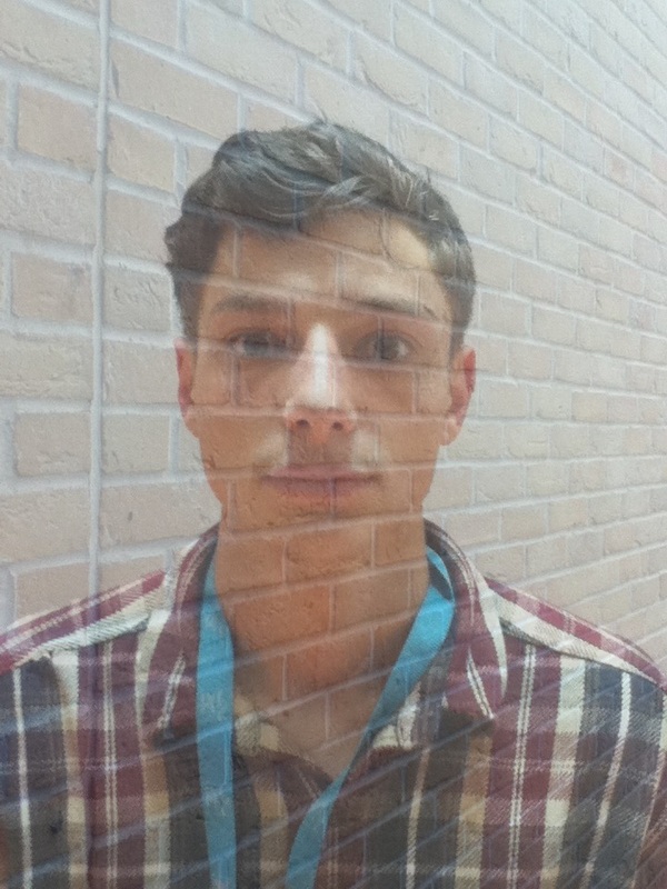
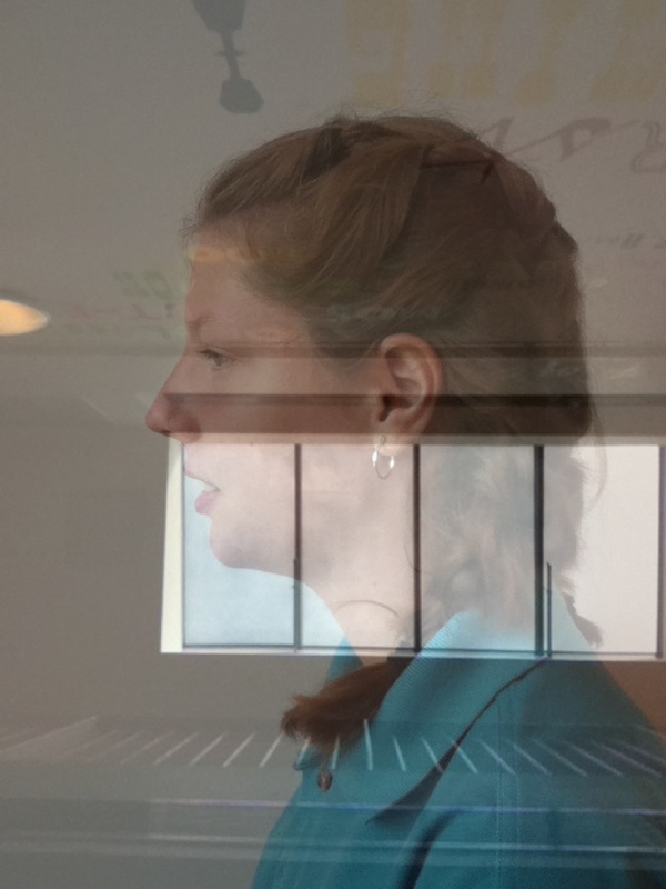
After looking at a couple of artists such as Edward weston and sally mann i started to blend a portrait of different peoples faces and building around school, i think most of the blending i did went well and suited the portrait very well some of the portraits stand out more depending on the background, such as the fourth one in the top row because the white and orange clash it makes the face stand out more.
I used natural lighting for all of my images, i blended most of the portraits with images from outside and inside, but one of my favourite photos showed light through a window because the natural lighting coming through the window mixes with portrait well it also makes the photo have a lighter tone.
the line in
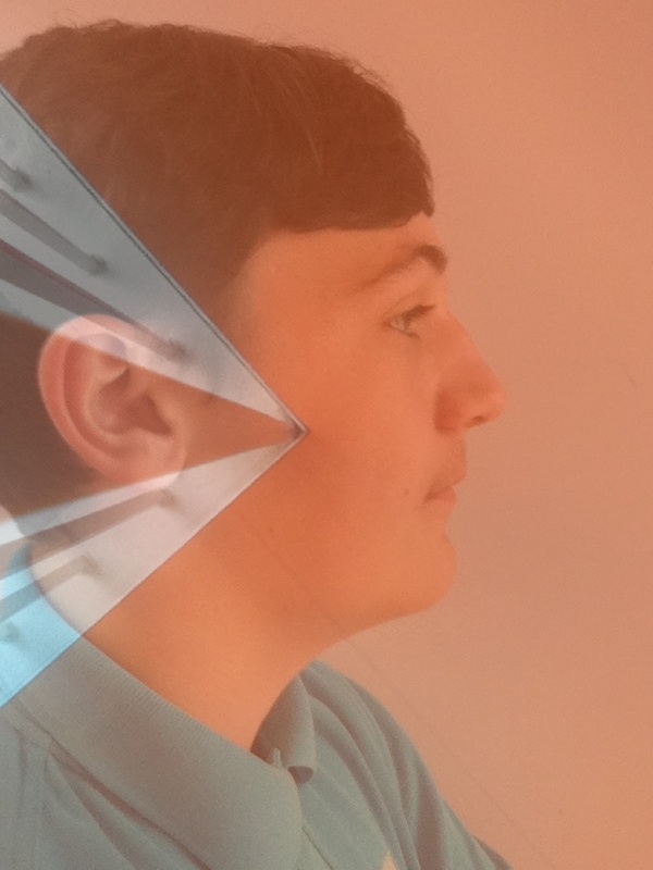
Contrast evaluation

The thing i have been doing all day is blending two images together i got this idea from the artist Antonio mora i chose it because its very abstract and when i put it in black and white because the topic we have been doing is black and white. At first i took out and ipod and took photos of peoples faces from my class and blended it in with buildings as an first experiment then i uploaded the photos and played around with them on photoshop and changed them into black and white then i played around with the exposer and the darkness and then i evaluated them and printed them and done more research on Antonio mora.
Holiday photos
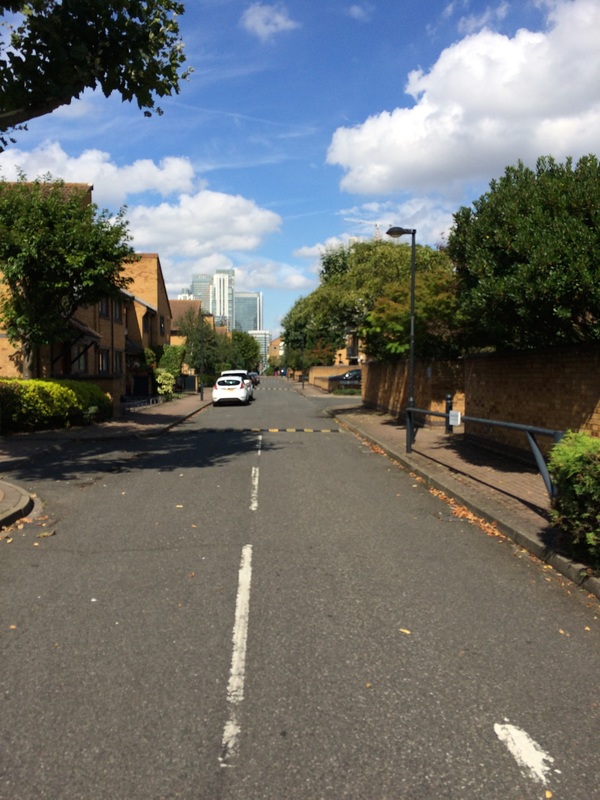
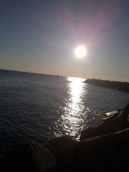
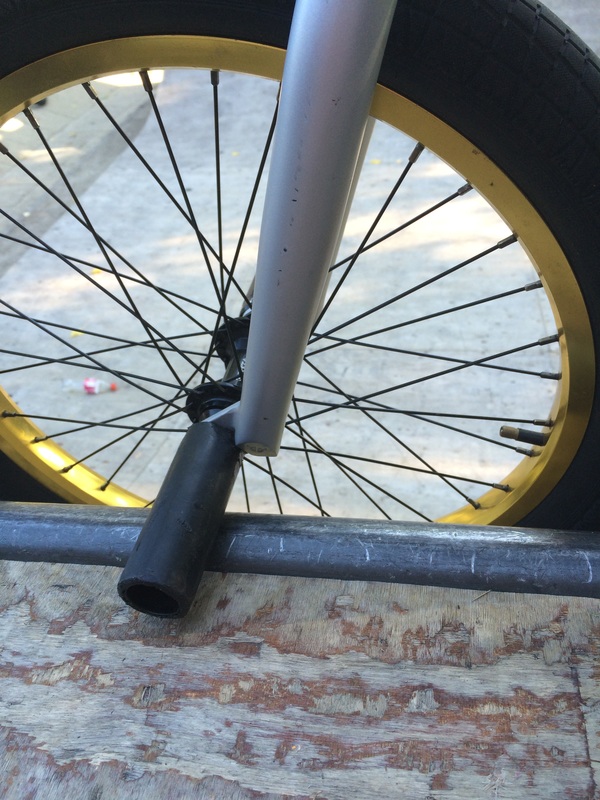
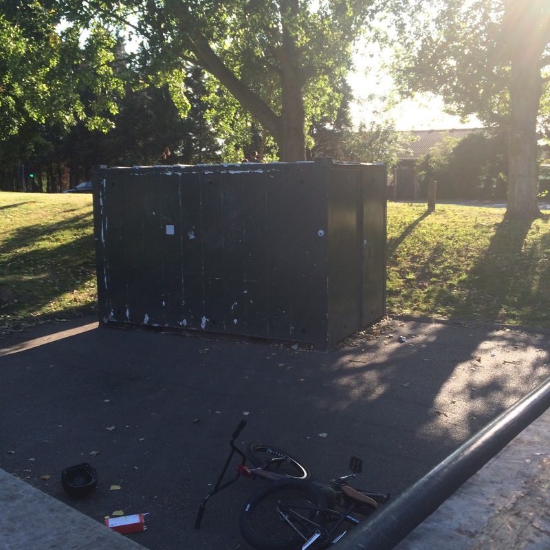
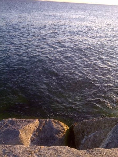
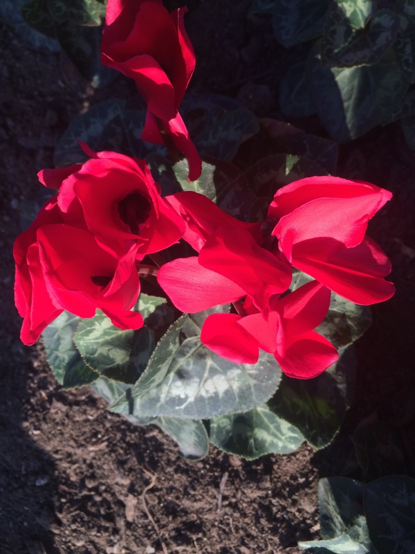
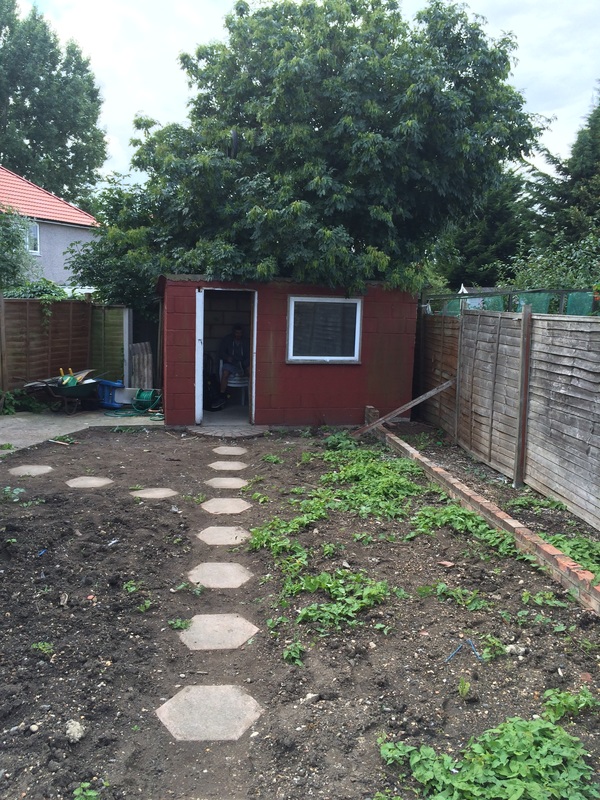
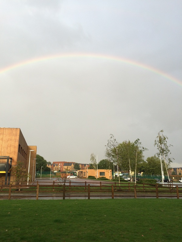
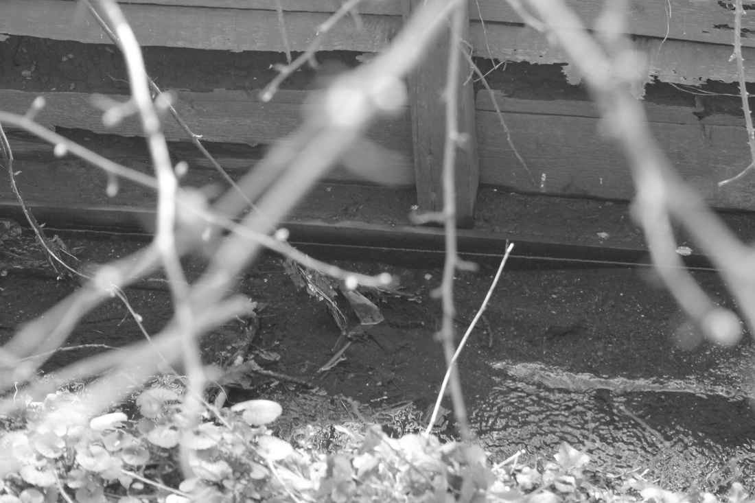
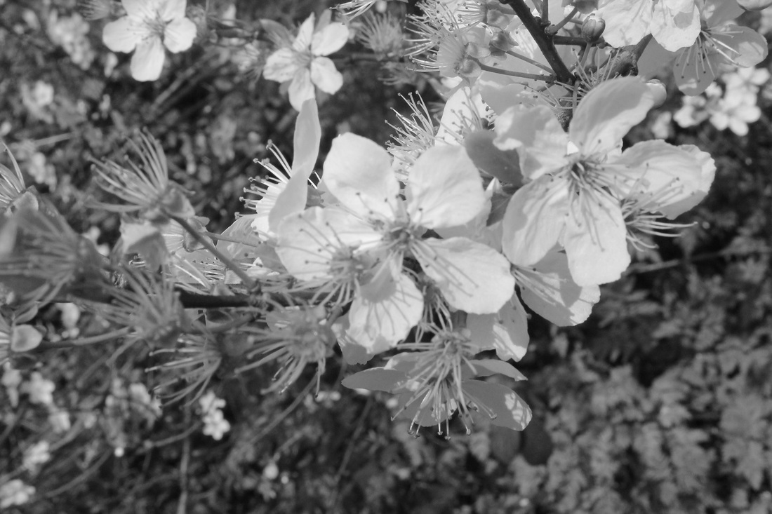
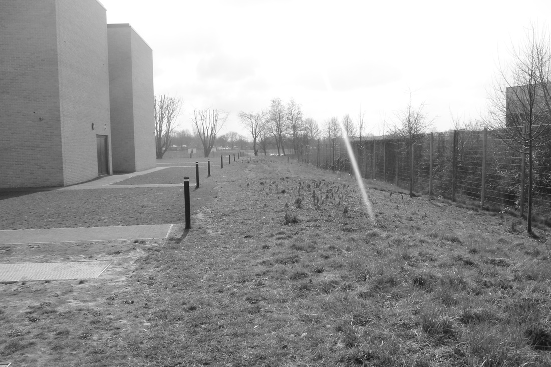
The relation to contrast from these photos are that in some of the photos there is different shades of colours for example in the top left side there is different shades of green to make the light and the dark on a natural balanced scale but some of my photos i have just focussed on the dark such as the second one on the top row, i've focussed on just the dark, the light in the third photo is hard texture of natural day light and over exposes only parts of the photo. Most of the photos i took where around my area but three of them i took in other places one of them i took in north London and the other i took in west sussex. I think that i took a good range of different looking photos also these images helped me to get new ideas and new editing style's on how to make my photos more colourful to achieve many effects, colour gives viewers a sense of mood,place and time of year and is abstract, also it helped me to get a few photos to get my final piece for example: The first and last of the top row.
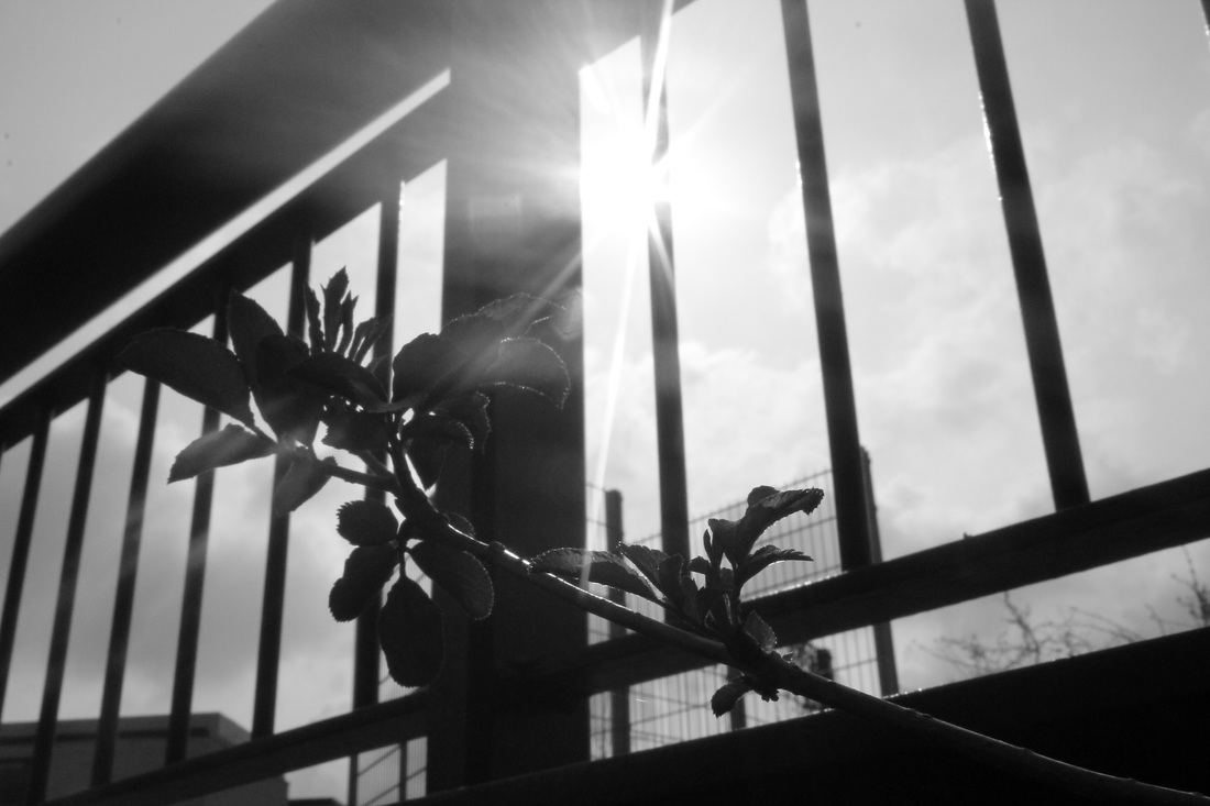
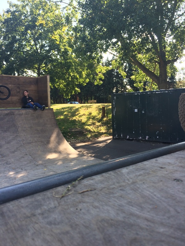
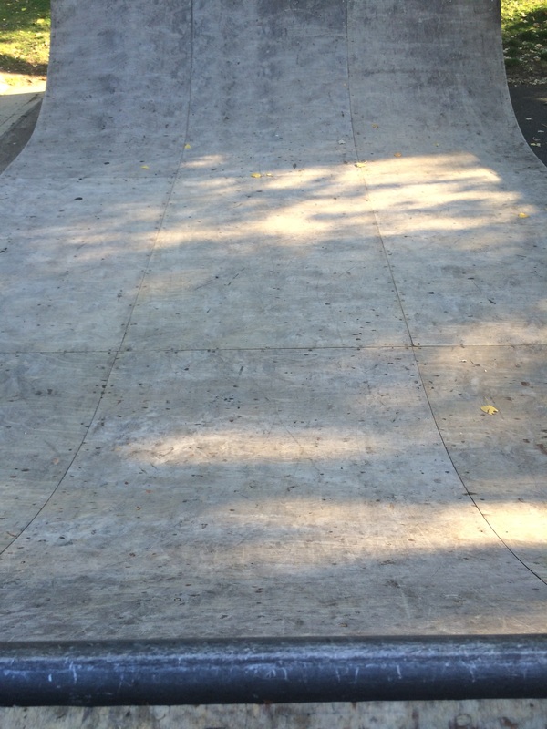
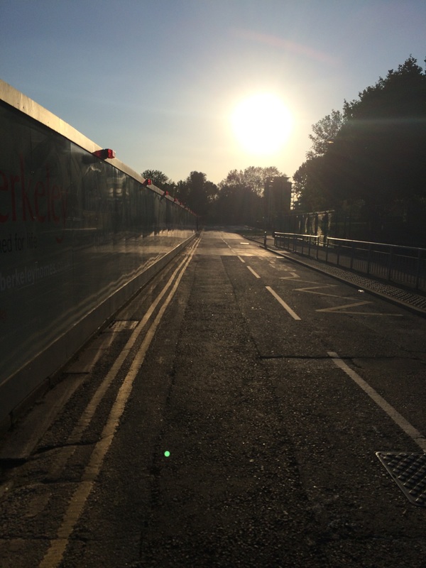
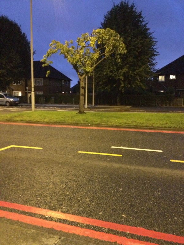
The fourth one i prefer because i like the way the blur contrasts between the ramp and the natural light piercing throughout trees i also like the way some parts of the photo is in focus and some parts are blurred. Next time i can improve this photo by doing the following: taking the photo at a different time of the day such as taking the photo in (the morning at sunrise or at sundown) i took it with my i phone but i think if i used a digital camera or used an effect on my phone the photo could of had a better outcome.
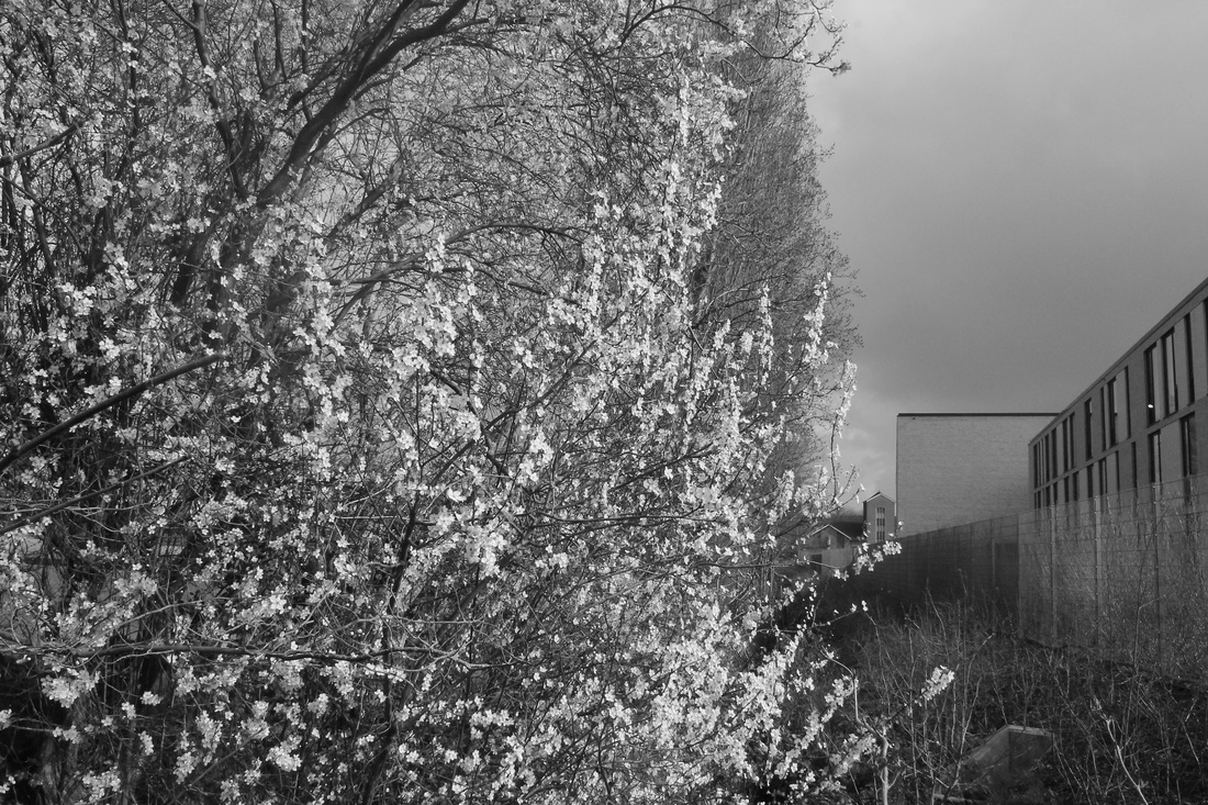
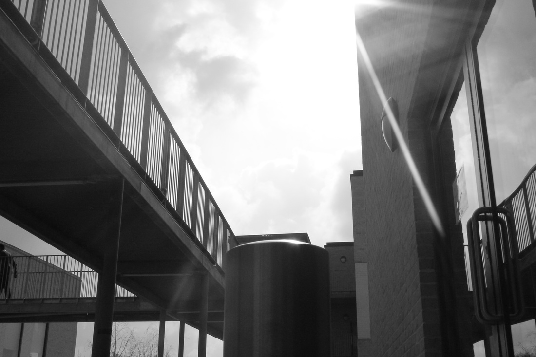
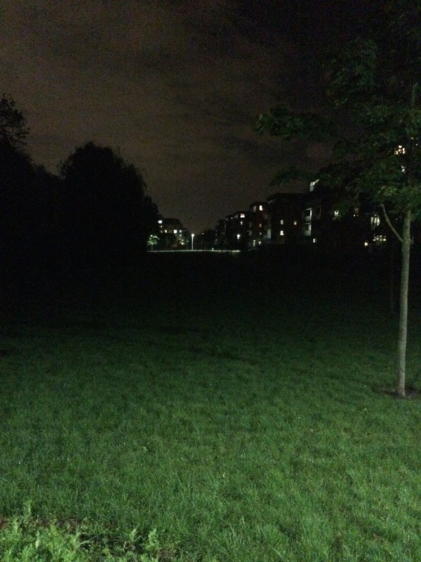
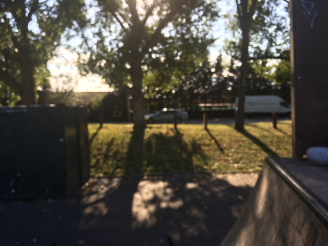
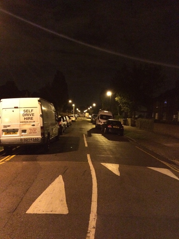
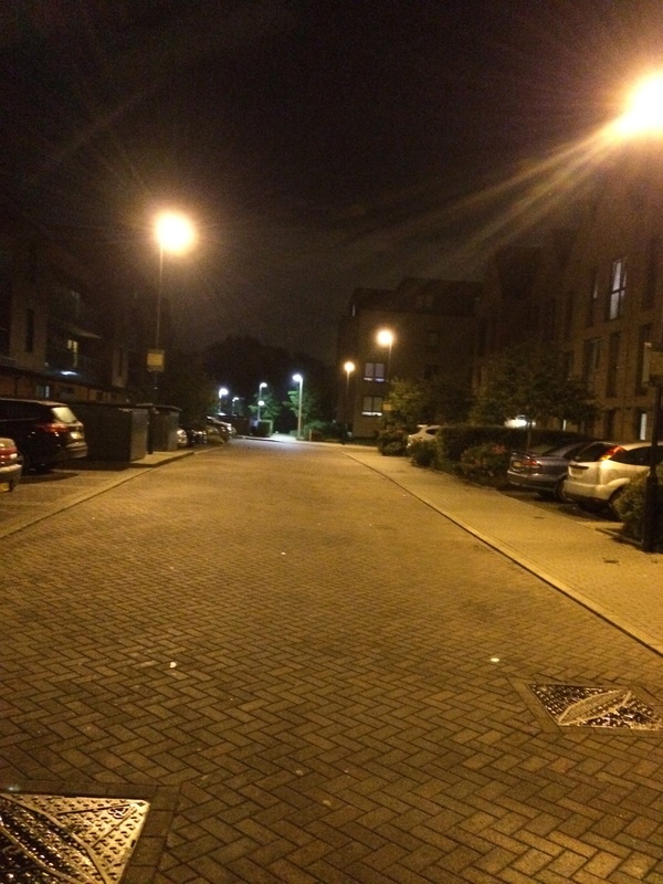
The one that didn't work the best is the one that the lights from the flats shining down on to the park the texture of the light is very smooth and is also dull, the soft focus is created when i manipulate the camera to achieve blurry and gentle edges. There is a lack of colour which takes away the mood which a colourful photo would give. If i took the photo at a different time such as (sunset or midday) it would give of a harder texture of lighting.
The fourth one i prefer because i like the way the blur contrasts between the ramp and the natural light piercing throughout trees i also like the way some parts of the photo is in focus and some parts are blurred. Next time i can improve this photo by doing the following: taking the photo at a different time of the day such as taking the photo in (the morning at sunrise or at sundown) i took it with my i phone but i think if i used a digital camera or used an effect on my phone the photo could of had a better outcome.
The one that didn't work the best is the one that the lights from the flats shining down on to the park the texture of the light is very smooth and is also dull, the soft focus is created when i manipulate the camera to achieve blurry and gentle edges. There is a lack of colour which takes away the mood which a colourful photo would give. If i took the photo at a different time such as (sunset or midday) it would give of a harder texture of lighting.