Michael huges

|
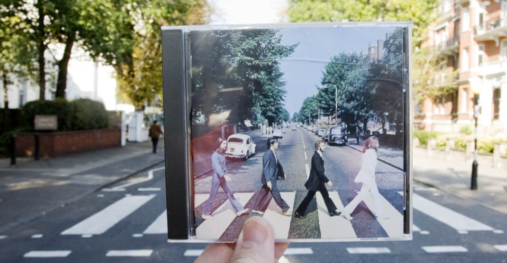
this photo stands out to me because i like the way he has used force perspective to make the cd cover merge in with the road because the way he has composed the cd case. In this photo i can see a person holding a cd with four men in suits walking across a zebra crossing and the road on the cd cover and the road behind the cd look the same so the person has made them look the same. The person has focused on the foreground rather than the background. Also the lighting in the photo is natural lighting
|
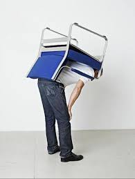
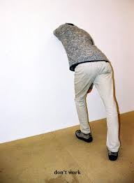
Erwin Wurm
|
|
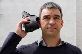
This photo is absurd because in reality no one holds a phone up to there ear like its a phone and Erwin Wurm has captured this to make us think that this photo is something natural that people do on an a every day bases, and this a simple but effective photo.
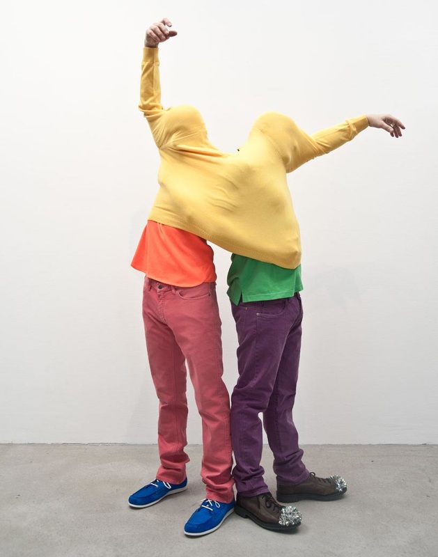
The other photo is also absurd because its strange to see two separate people share the same sweater and i find the way they have been positioned is very absurd because there arms are quite strange shaped and angled and i think Erwin Wurm has captured absurd very well. |
David Shrigley signs
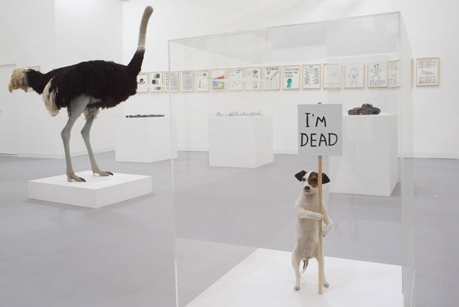

in the first photo it looks like the photo was taken in a exhibition and there is a ostrich in the background and a dog in the four ground holding a sign saying i'm dead, three words i would use to describe this photo would be strange, wacky and dumb, the way i would describe this image would be, imagine a exhibition room with a ostrich and a dog in glass boxes and a dog holding up a sign on a stick saying i'm dead, this photo is a abstract photo because its not a usual thing too do with a stuffed dog, i recognise the setting of the photo what seems new is that the dog is holding a sign saying i'm dead.
ORIGINAL
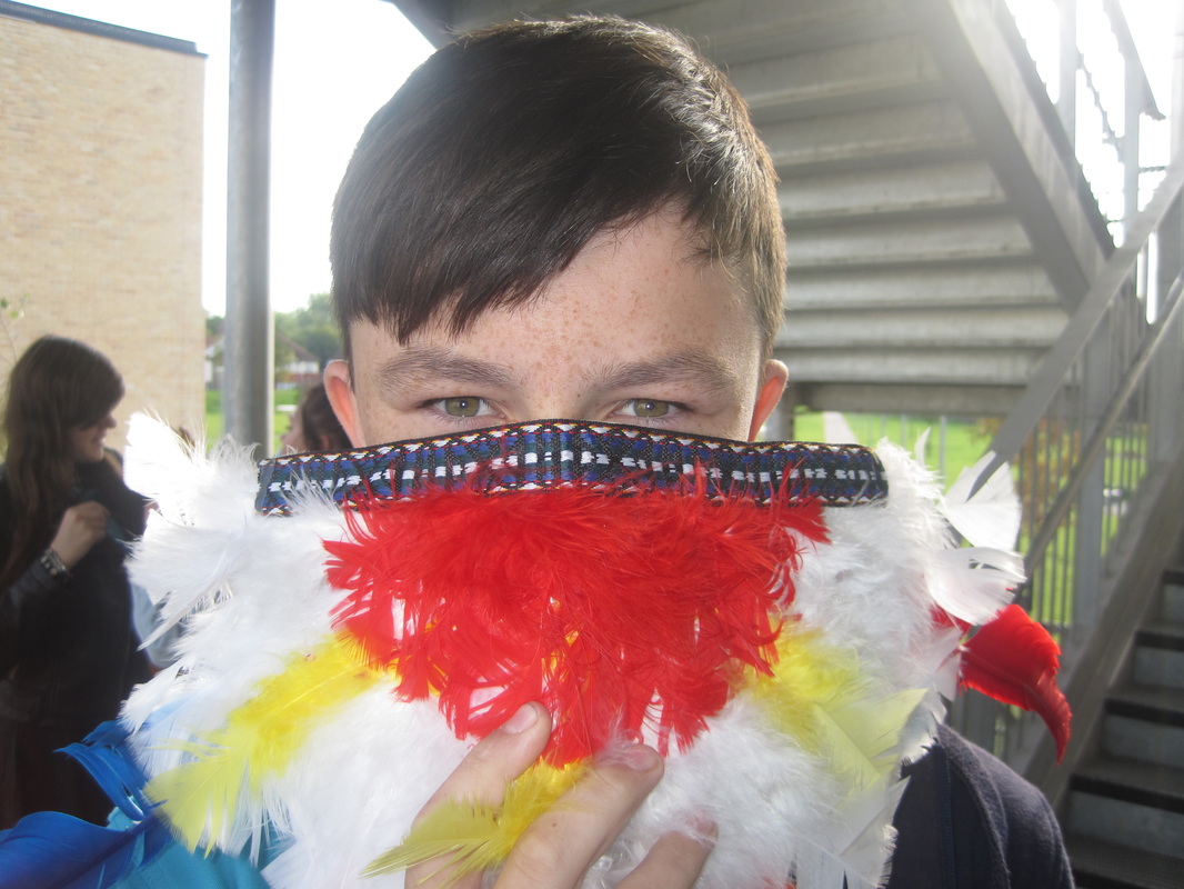
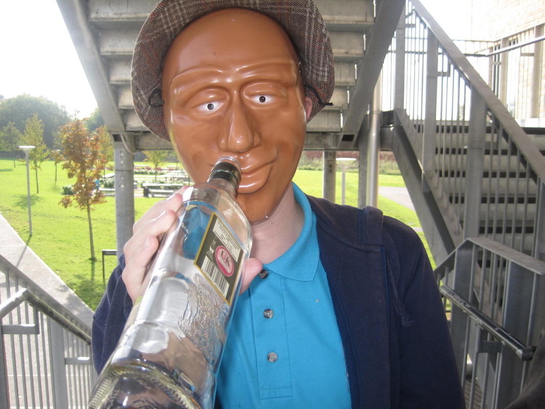
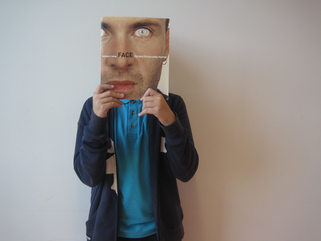
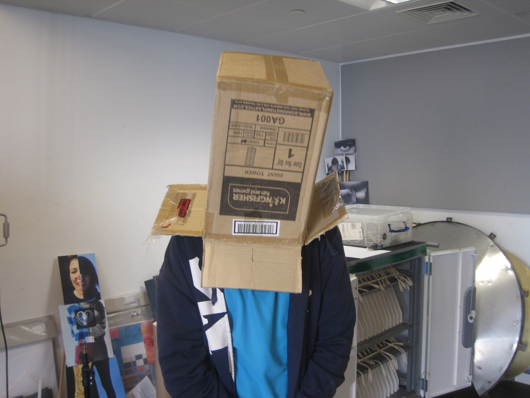
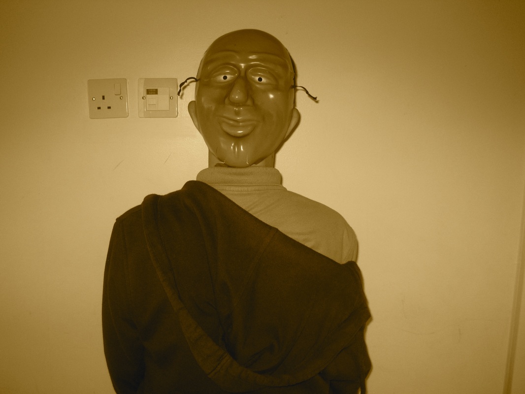
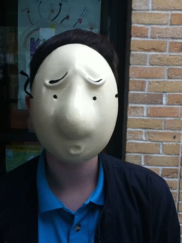
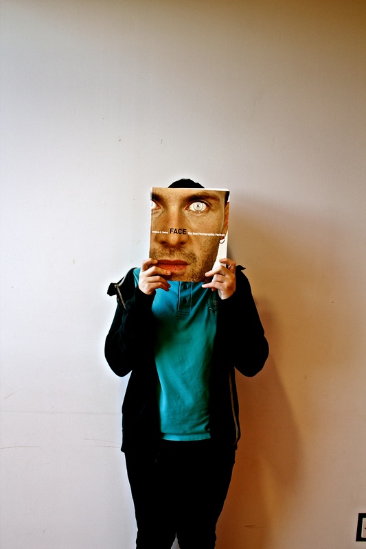
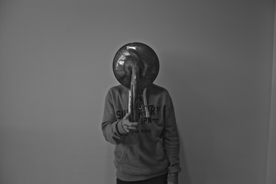
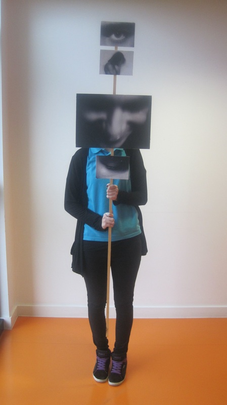
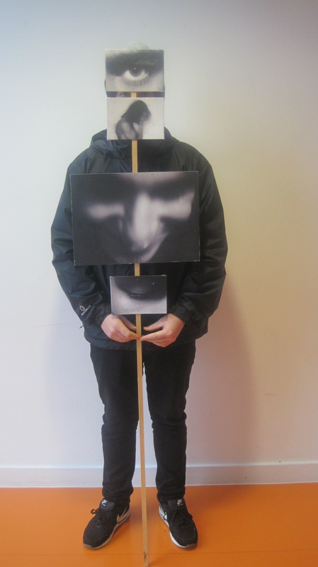
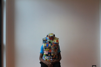
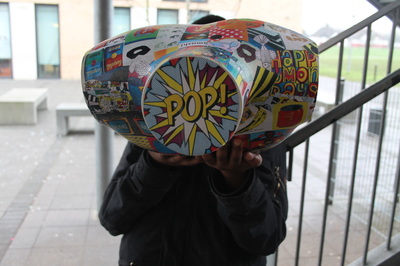
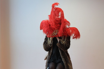
. w.w.w- i think i used the absurd theme well because i used things to hide the face well using different objects/props, i also think the composition was good such as the third and the sixth one the backgrounds are a white wall which is simple and effective to make the main part of the photo, i also like the lighting in these photos because some are dark and some are light for example the seventh photo is the darkest of them all but i like it the most because the object/prop he is holding. The idea behind this images was to use different objects to cover a part of the face or whole of the persons face.
E.B.I- to improve this photo i would put the person in an abstract environment with them doing and absurd action or movement or i would place the person in a natural environment doing, holding or wearing an abstract thing.
E.B.I- to improve this photo i would put the person in an abstract environment with them doing and absurd action or movement or i would place the person in a natural environment doing, holding or wearing an abstract thing.
EDITED IMAGES
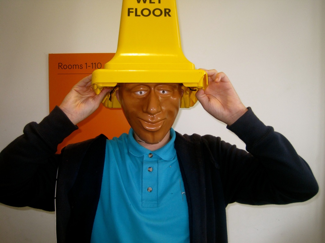
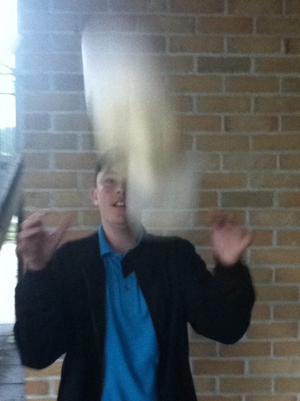
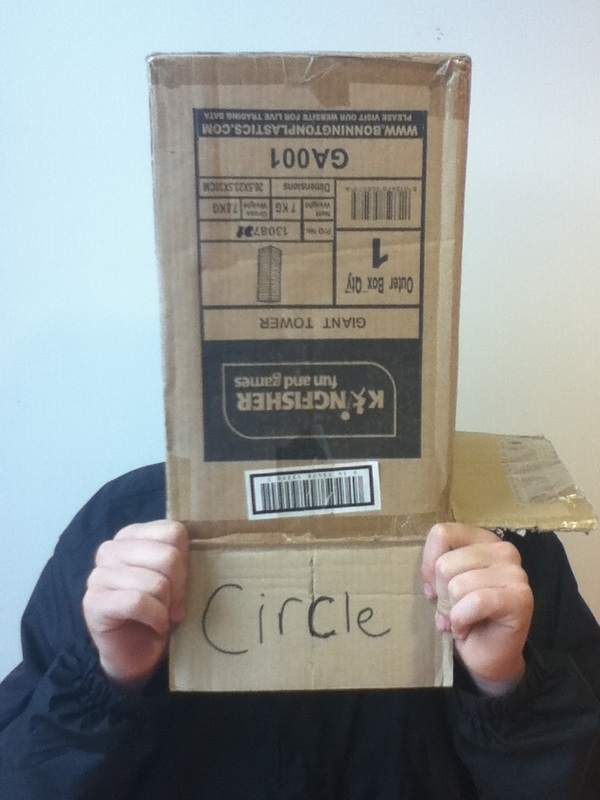
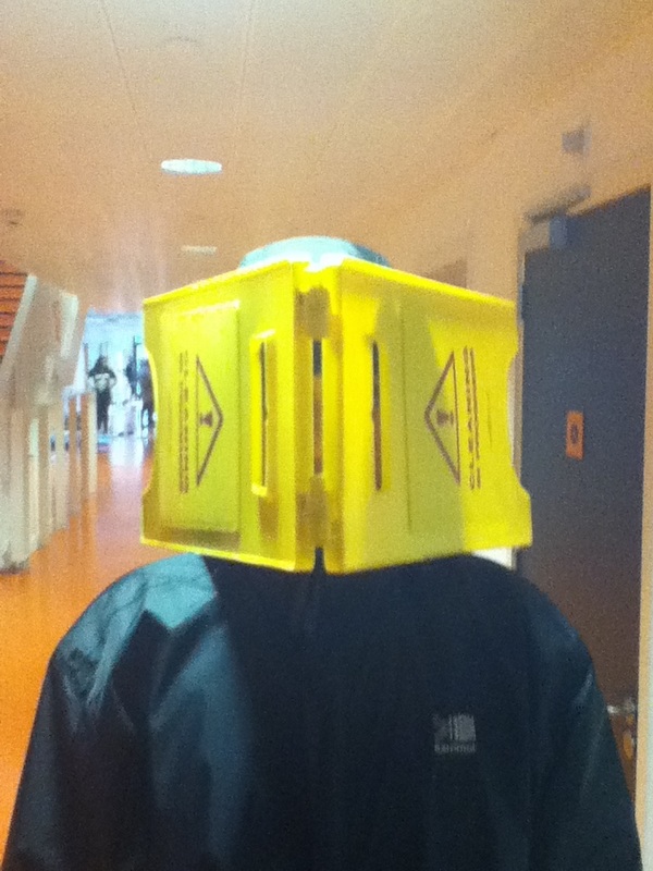
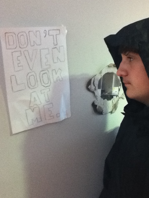
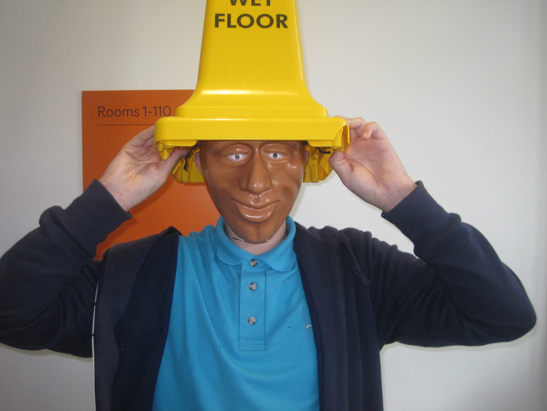
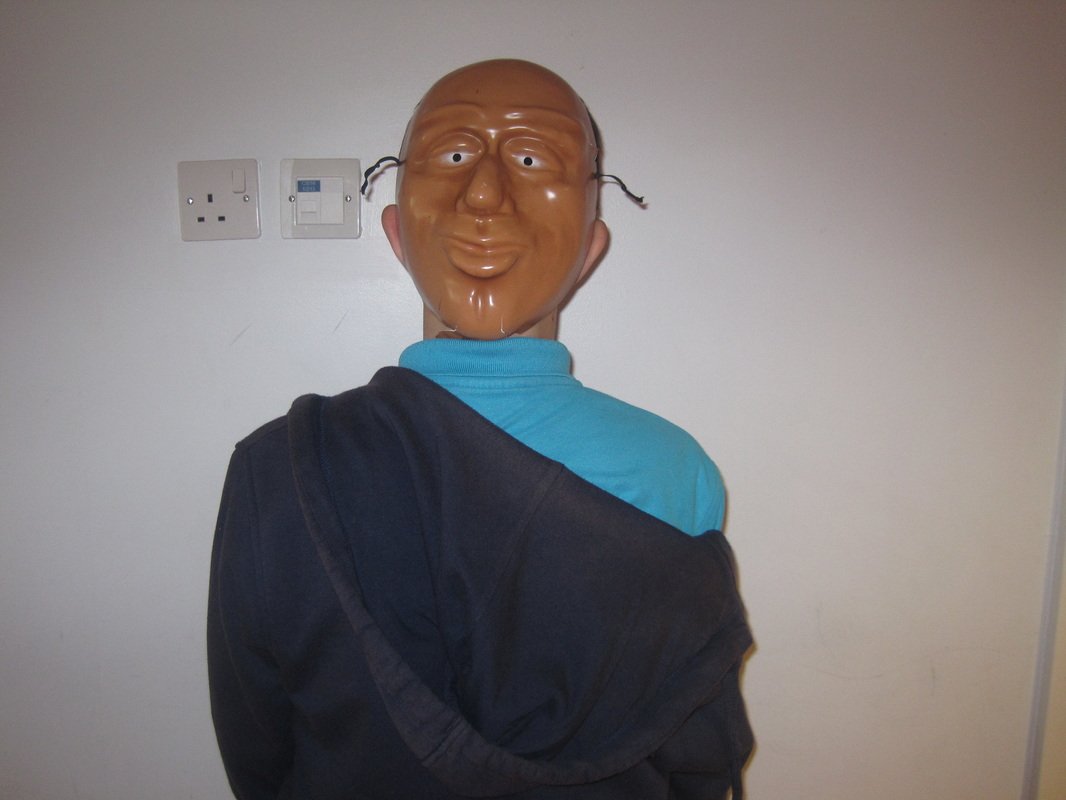
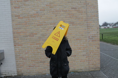
the was was to take absurd photos of people hiding there faces my inspiration came from looking at Erwin Wurm i used masks to hide peoples face because even thou you cant see the persons face there is still a facial expression there i thought of it like if you think someone looks ok you cant be sure, i think the photo witch the wet floor sign hiding the persons face went well because its not normal to hide someones face with a wet floor sing which i think is the hole point of this subject, i think the image where the boy has thrown something in the air didn't work well because there was nothing in that photo absurd and it wasn't hiding his face next time i do it i would make the blur cover his face, if i were to do this photo shoot again i would use different things to hide the persons face.
set 1
sign set 2
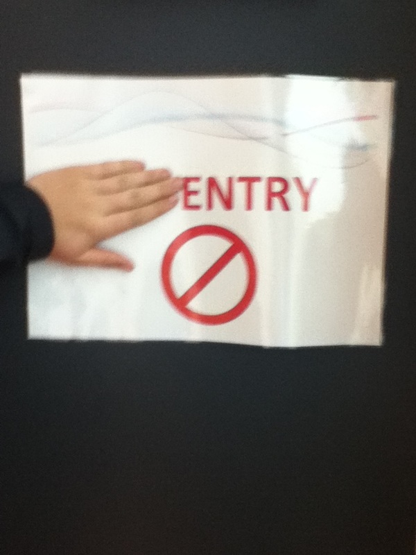
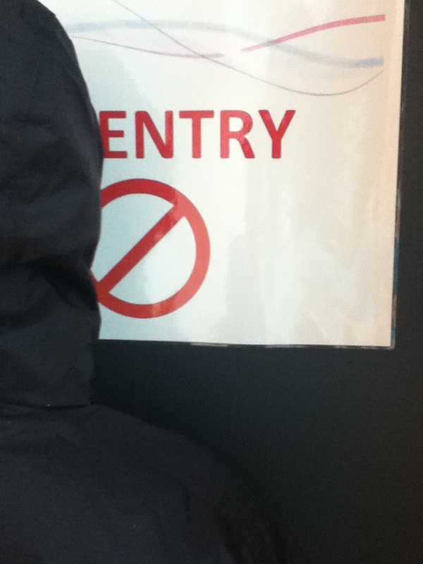
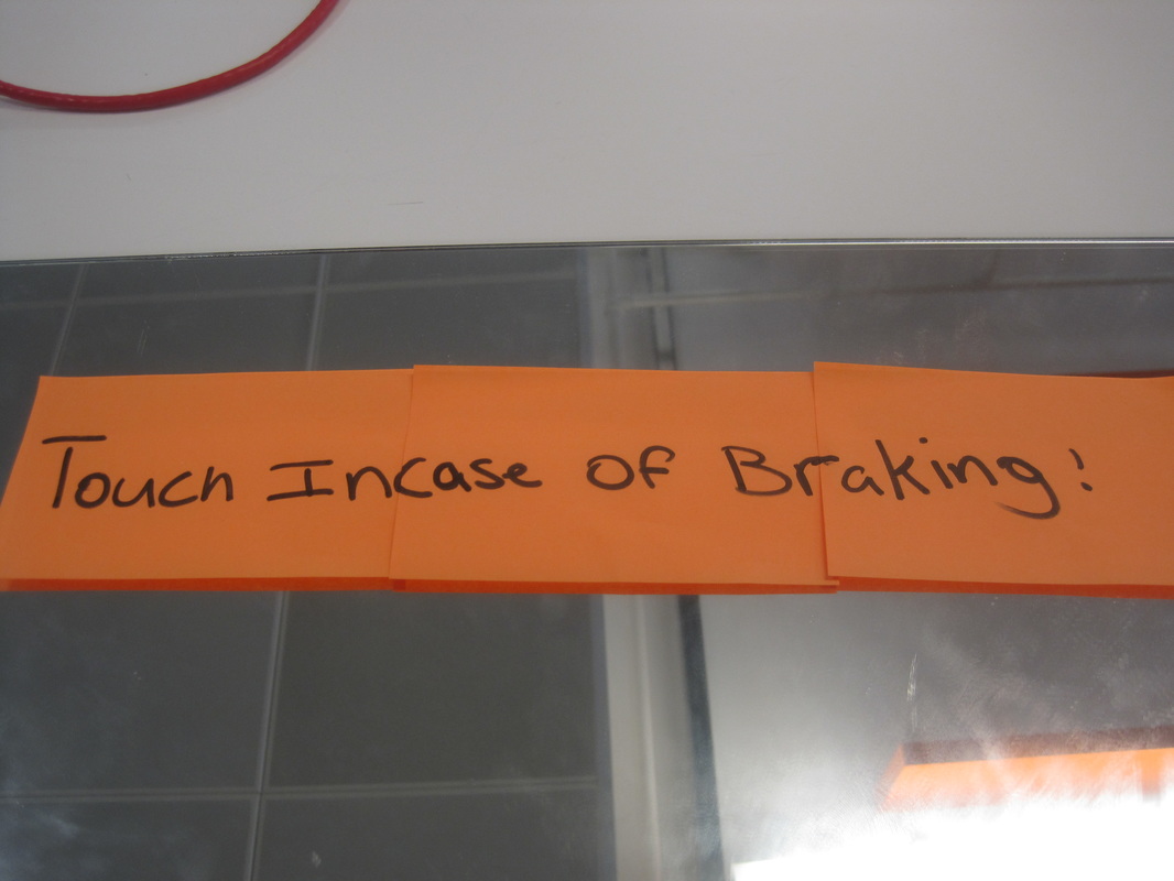
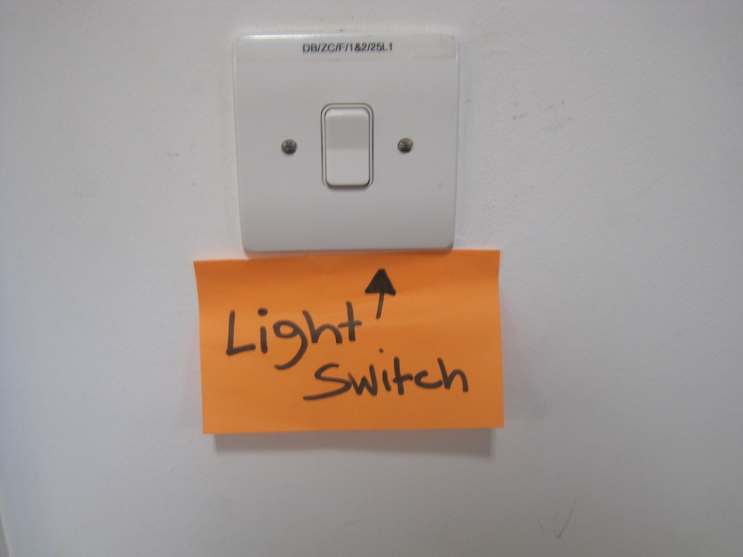
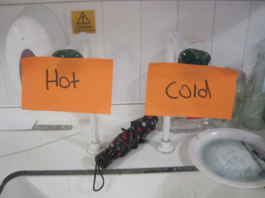
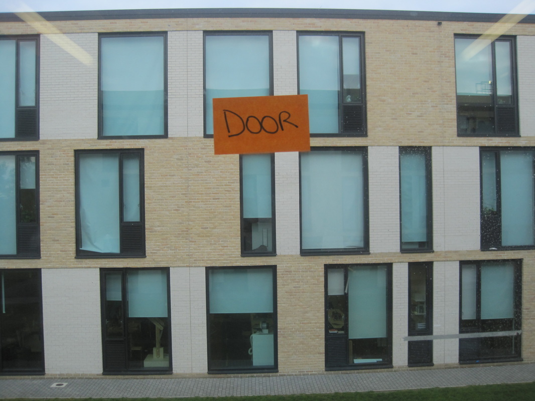
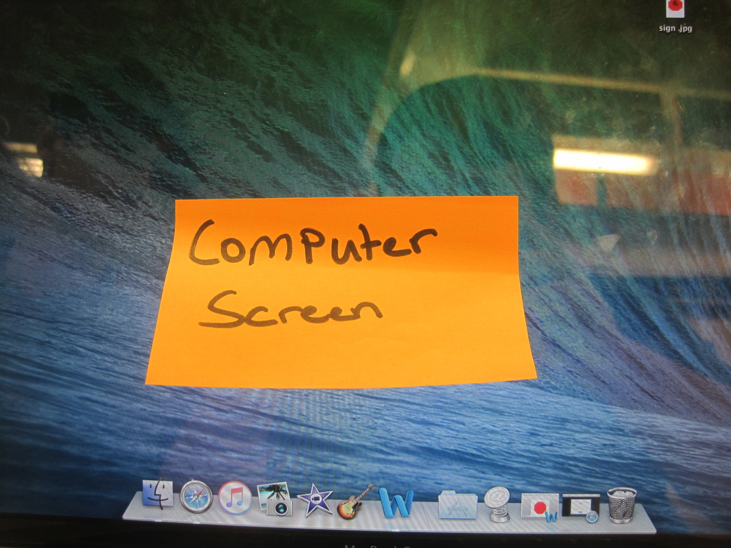
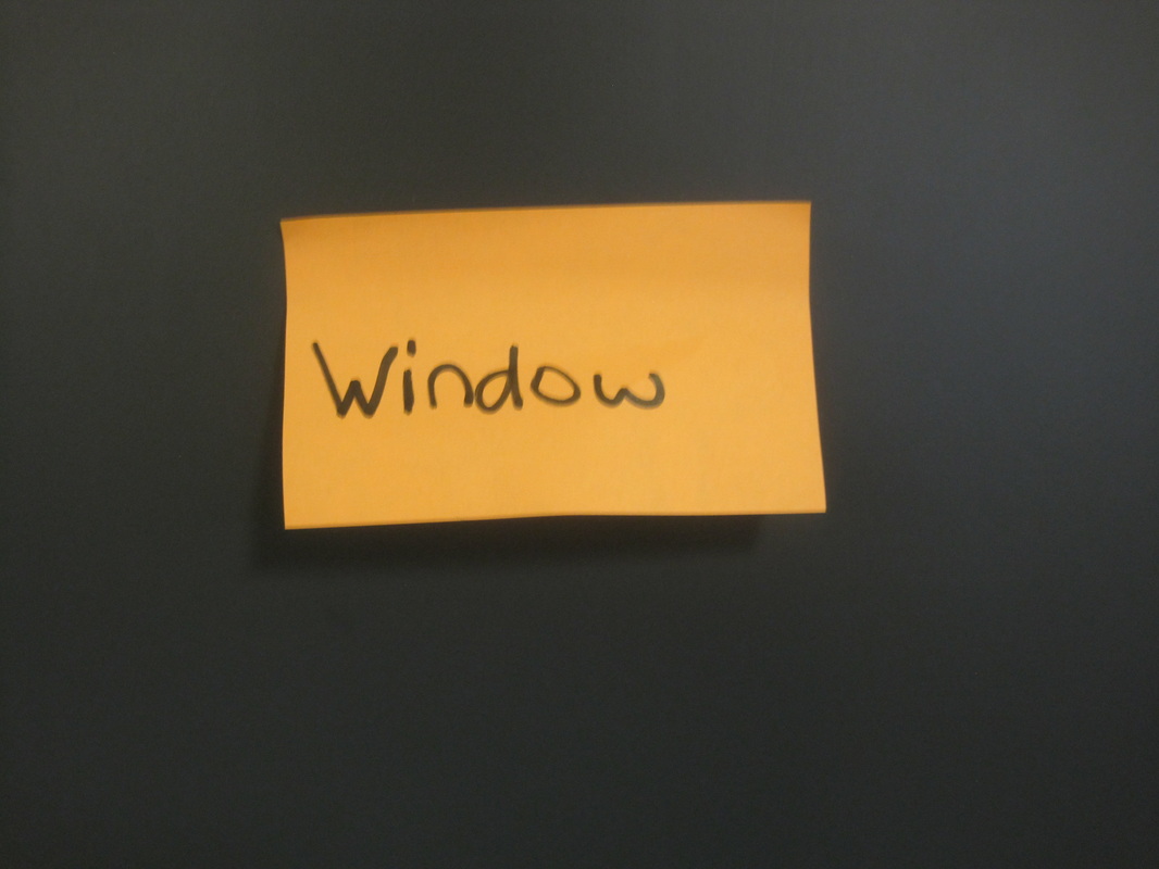
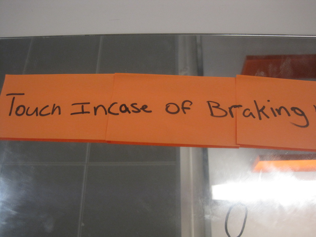
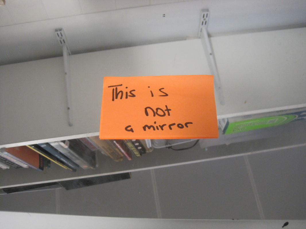
I dont like any of this photos because i did not think about them and they were just experimentation's, i didn't think about what i wrote on the posted notes if i could improve these photos i would look what to write on them and stick them in different places to make my photos more humorous and interesting because with signs it has to be weird and eye catching.
I don't think any of these photos went well to improve them i will change the setting of the image and i would also print of my own sign and write something on there and stick them somewhere really obvious
I don't think any of these photos went well to improve them i will change the setting of the image and i would also print of my own sign and write something on there and stick them somewhere really obvious
www- i don't think any of my photos work because i didn't put thought into the composition and the angles or lighting or what i wanted to achieve by using these signs
E.B.I- to improve my work i need to think about what signs i want and the composition and lighting such as if i want it in natural day light or composed light and i also could of thought of more absurd/out of the box ideas to make these photos connect more with the topic of absurd photography.
E.B.I- to improve my work i need to think about what signs i want and the composition and lighting such as if i want it in natural day light or composed light and i also could of thought of more absurd/out of the box ideas to make these photos connect more with the topic of absurd photography.
Michael huges
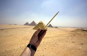
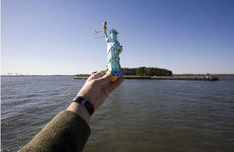
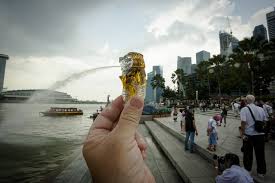
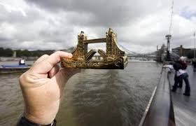
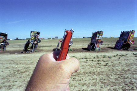
Michael huges is a photographer that uses objects of land marks and living things and puts them in front of them he well uses composition and timing to capture these photos at perfect timing in a lot of his photos he uses famous landmarks such as tower bridge and others, he dose not use a lot of equitment just and object and his camera i think his is very good with composition in a simple way to get these photos captured right i think Michael is trying to say no matter how small something is, it can still have a massive impact if i was to ask him any question it would be what started this theme off.With the top left photo i can see he used a small pyramid that he has held in front of a real life pyramid he has used natural lighting and composition, he used good composition on the bottom left he captured it at perfect timing, if i was to ask him any more question it would be how did you capture the bottom left photo so good.
hide set 1
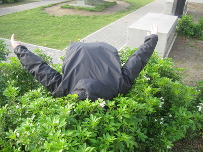
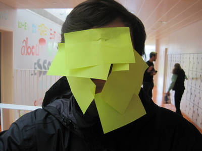
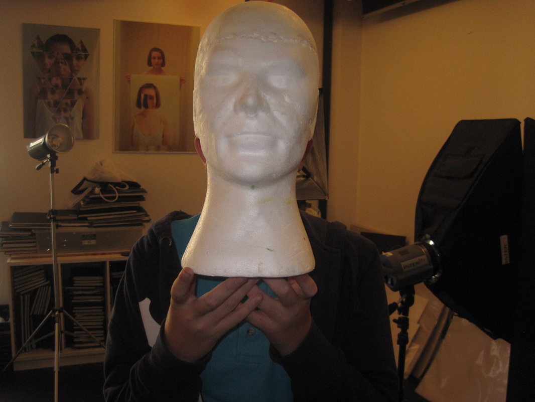
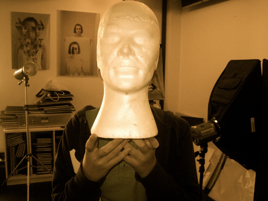
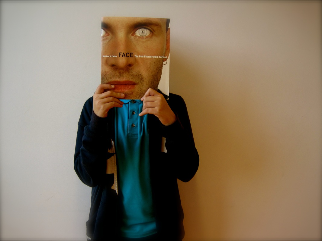
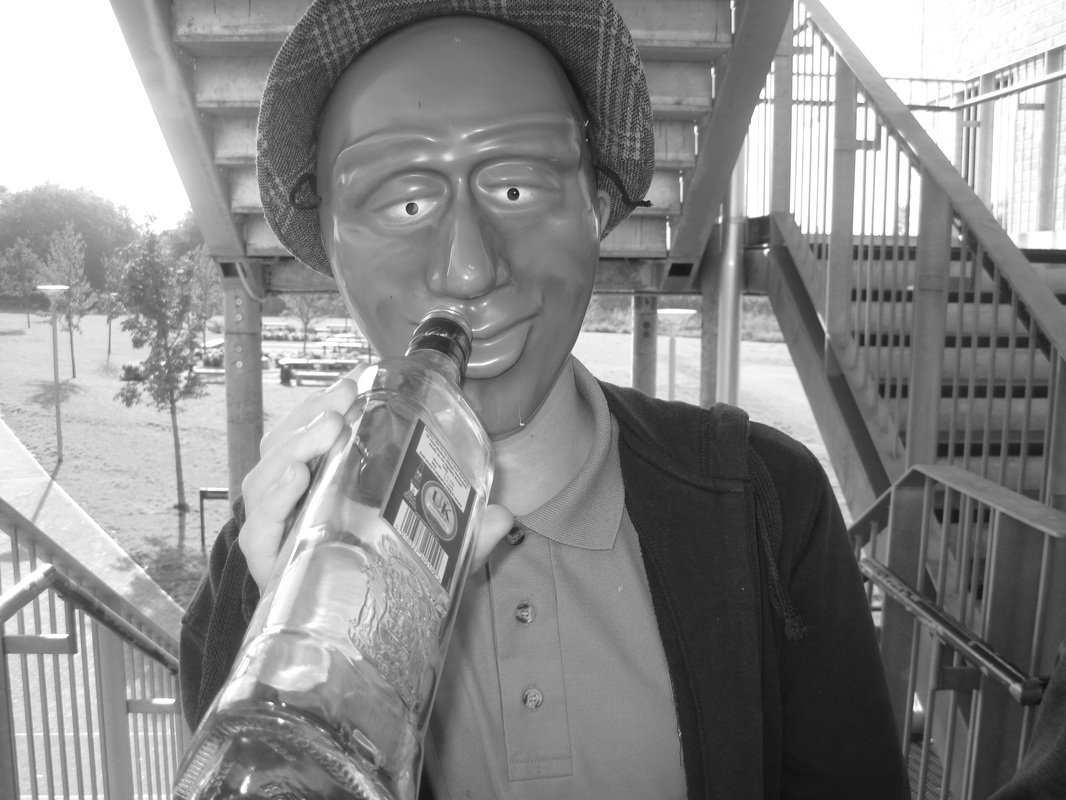
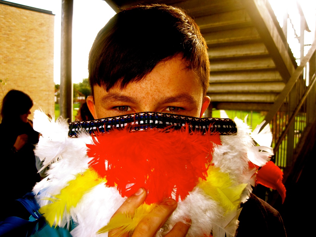
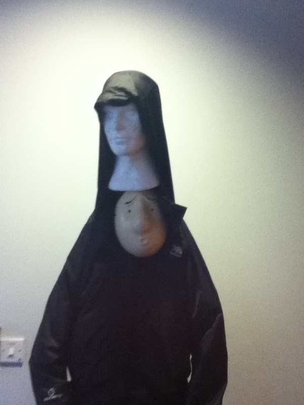
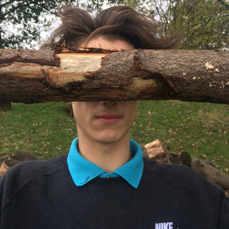
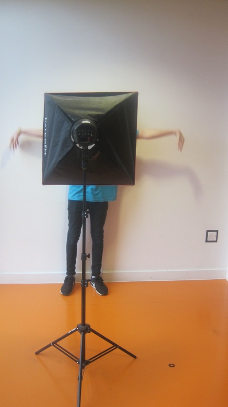
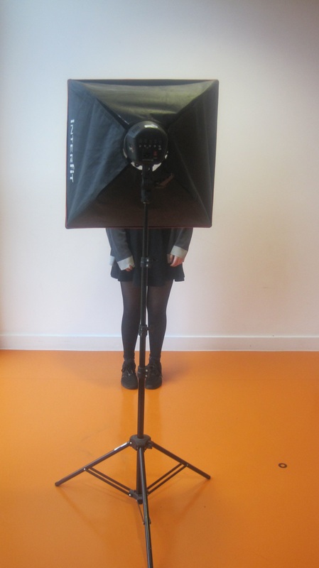
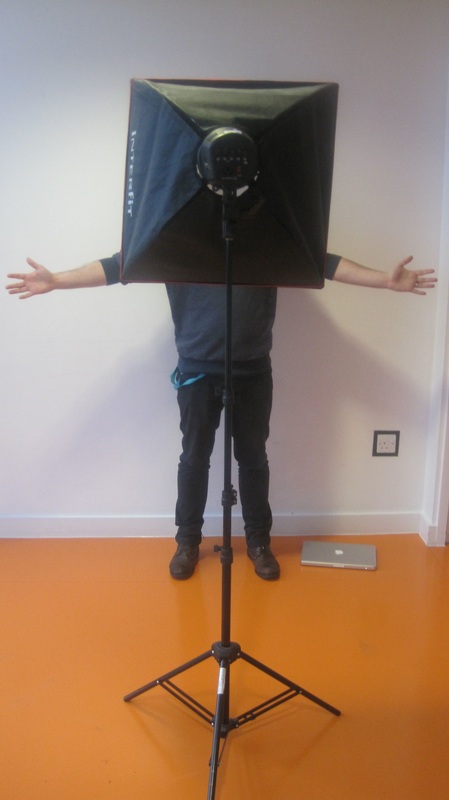
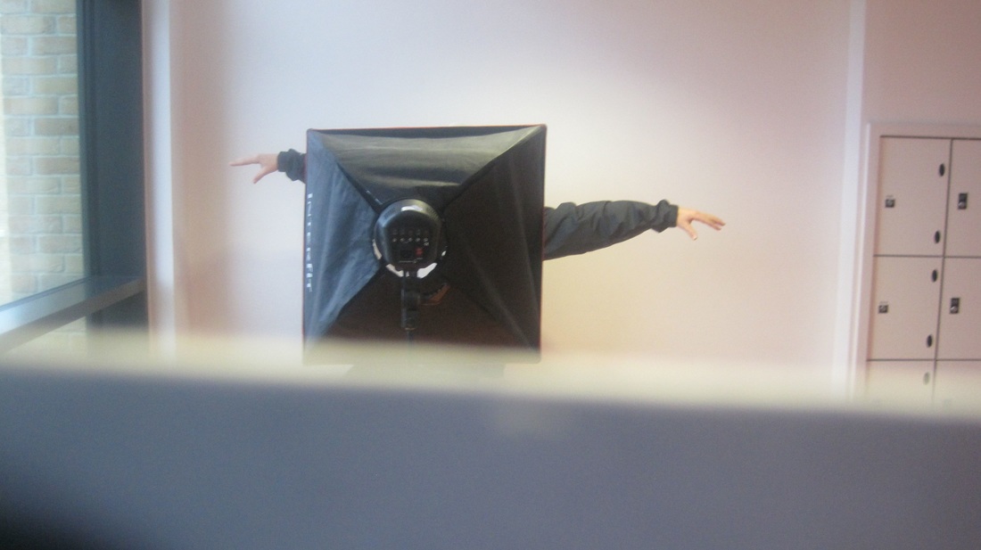
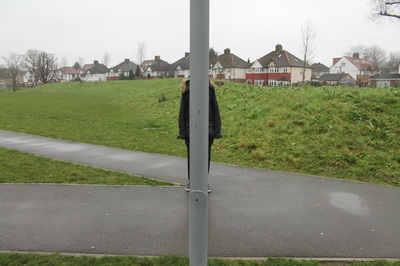
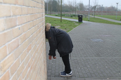
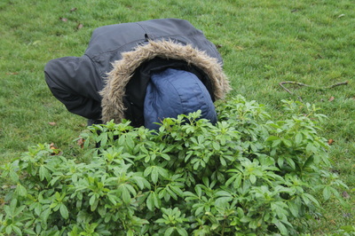
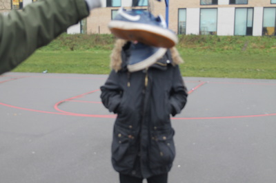
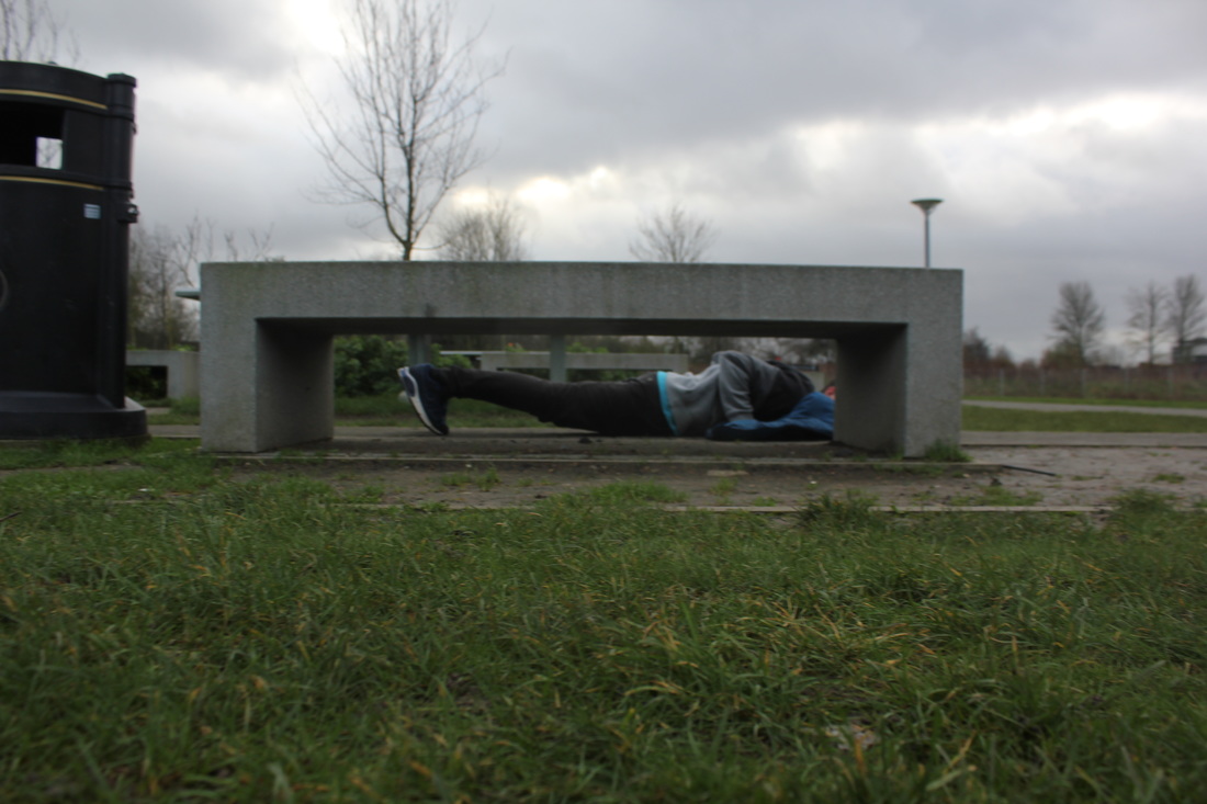
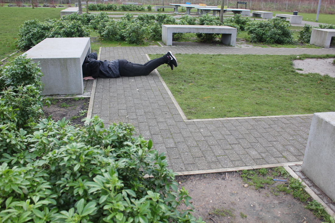
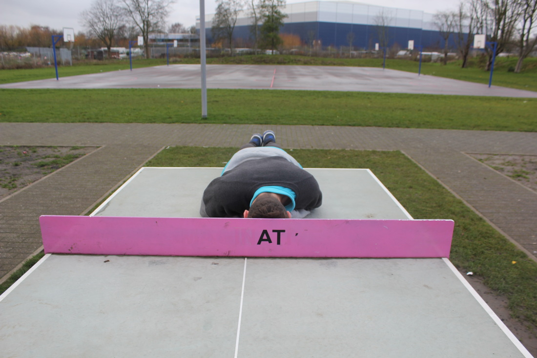
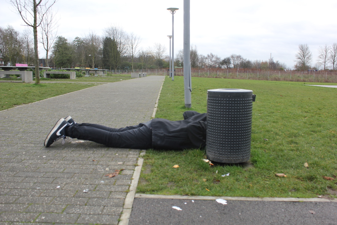
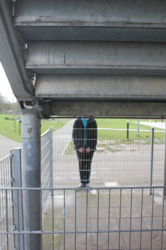
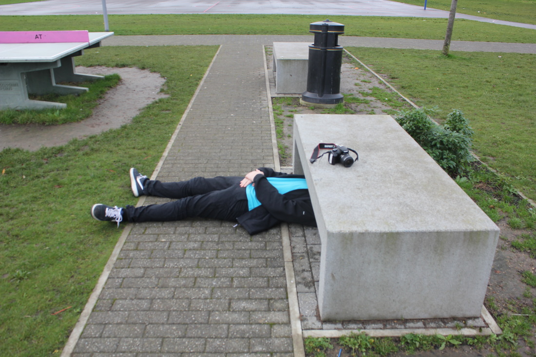
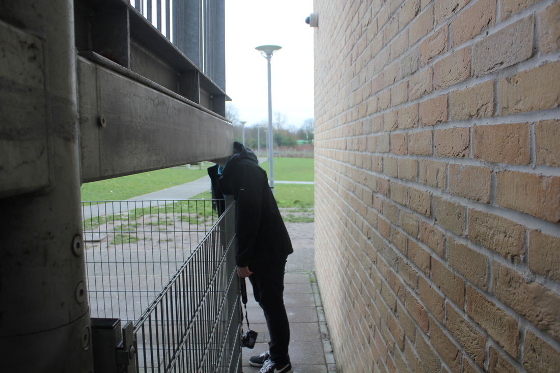
These photos went well because i hide the persons face using natural objects but in a absurd way i got this idea from looking at a pintrest of hide the photo that caught my eye was the women with a role neck and glasses covering the bottom half of her face
hide set 2
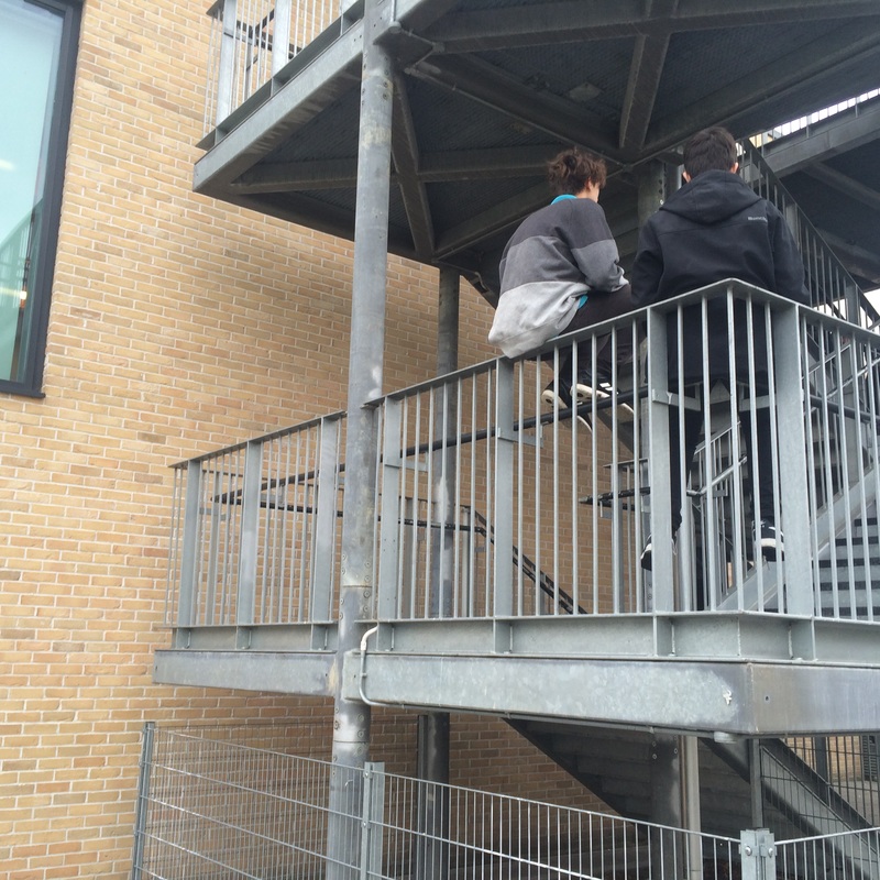
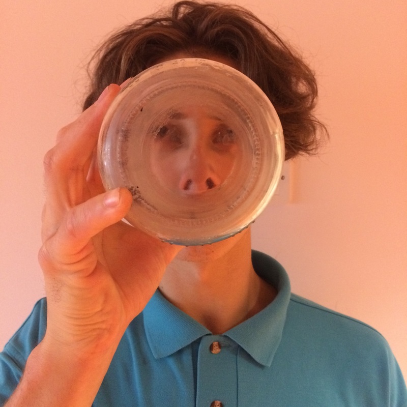
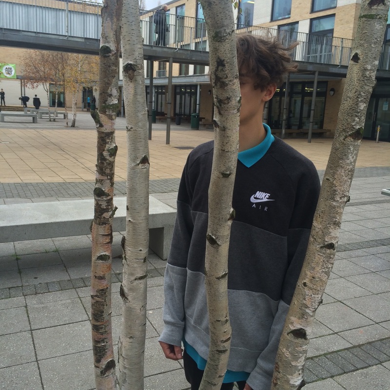
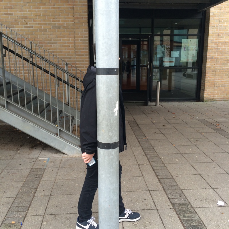
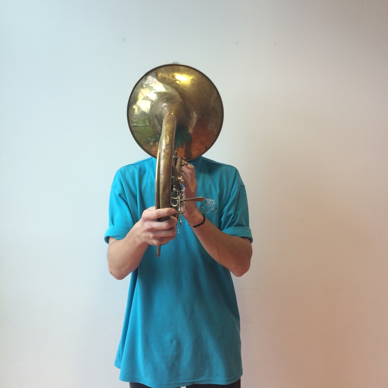
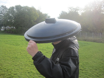
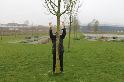
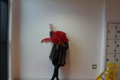
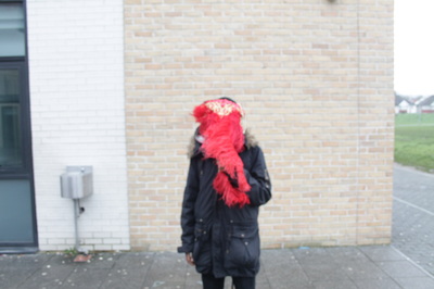
I liken these photos of hide because they are simple well composed i think they worked well because in all the photos i only used one specific part of the body too hide, if i could change these photos i would mix up on different body parts to hide to make it more imaginative.
If i could improve this photos i would use different objects to cover the model's face and place the model in different body shapes too add the extra effect of absurd, i would also think about the background on the photo too see how different scenery would look in this type of photo.
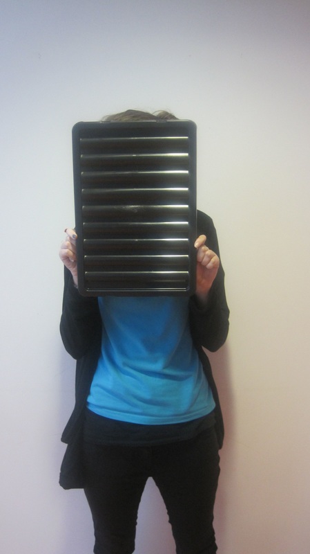
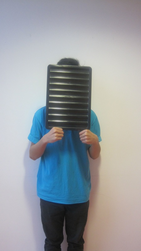
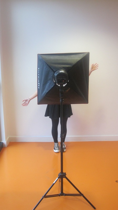

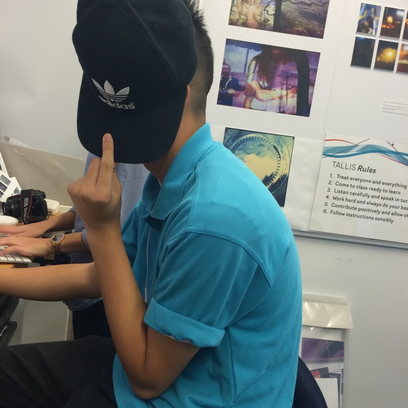
the topic of my photos is hide, the first thing i did was get a black tray and cover a selected amount of people, and then i chose a light box to cover another group of people still using the white background, i think the composition of the photo went well and the natural lighting coming through the window helped to get a natural and simple effect on these photos.
If i could improve this photos i would get two people with objects covering there faces whilst having a conversation and make the photos look natural and making the people look very natural in what they do just with objects covering there faces.
If i could improve this photos i would get two people with objects covering there faces whilst having a conversation and make the photos look natural and making the people look very natural in what they do just with objects covering there faces.
I tried to use different objects to cover the peoples faces but I don't think it worked as well as I wanted or imagined so i think it would be better to go back to the 1st lot of photos i did because they were they worked the best and were the most absurd group of photos, so i think i would use them again.
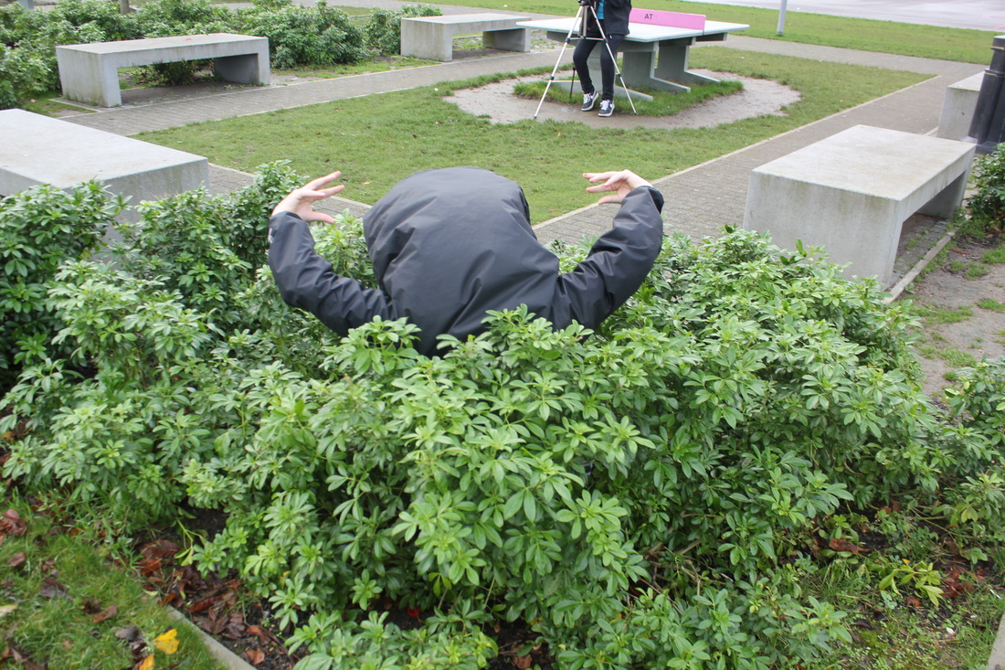
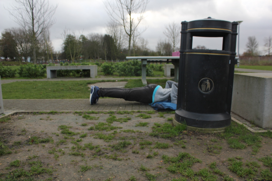
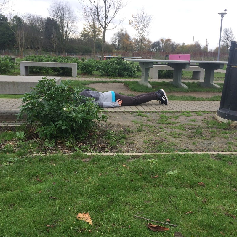
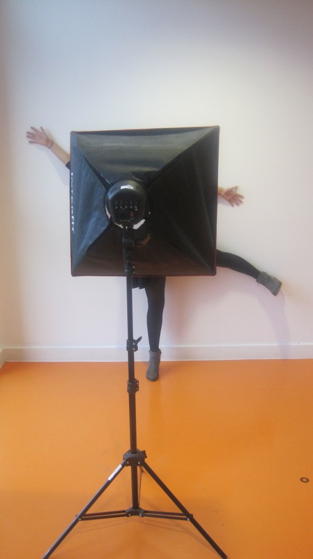
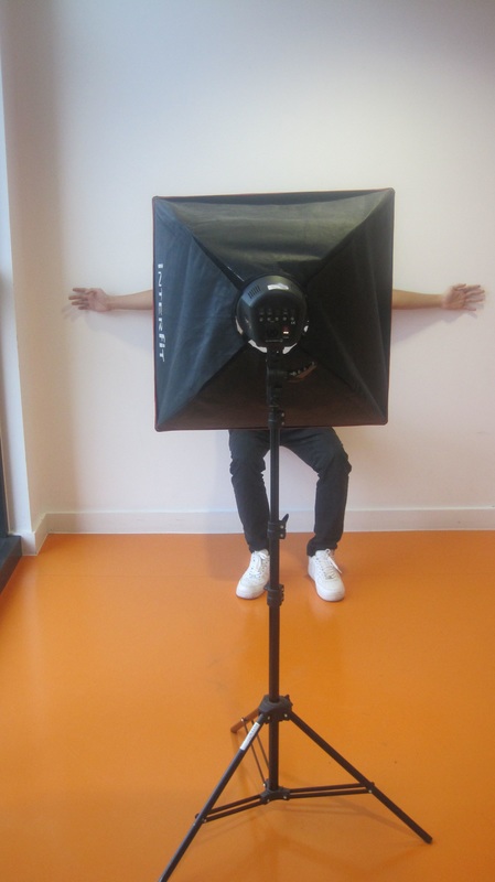
I think these photos went well because i made the people lay or stand in a normal ways and then hide there faces in absurd ways
of i was going to improve this photo i would maybe use film or think more about the background and how i composed the photo and the lighting on the photo also i could also change the angle of the photo because they are quite similar.
of i was going to improve this photo i would maybe use film or think more about the background and how i composed the photo and the lighting on the photo also i could also change the angle of the photo because they are quite similar.
|
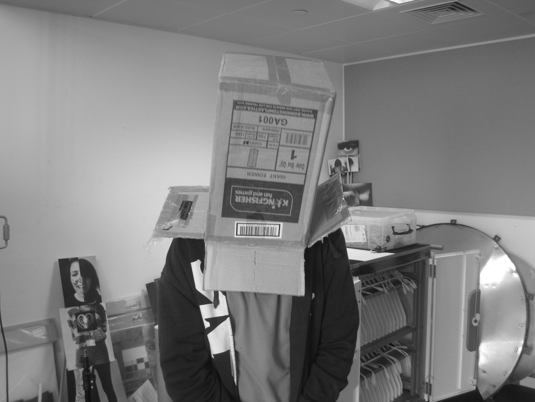
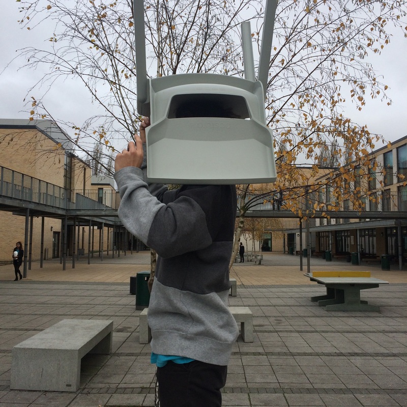
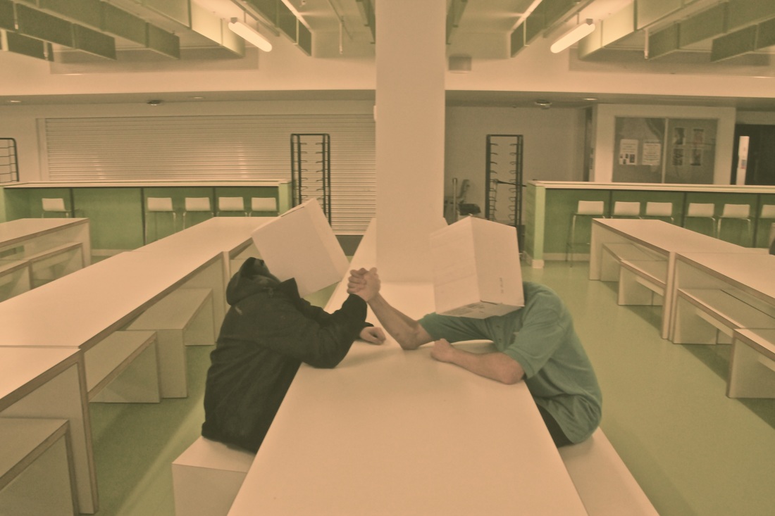
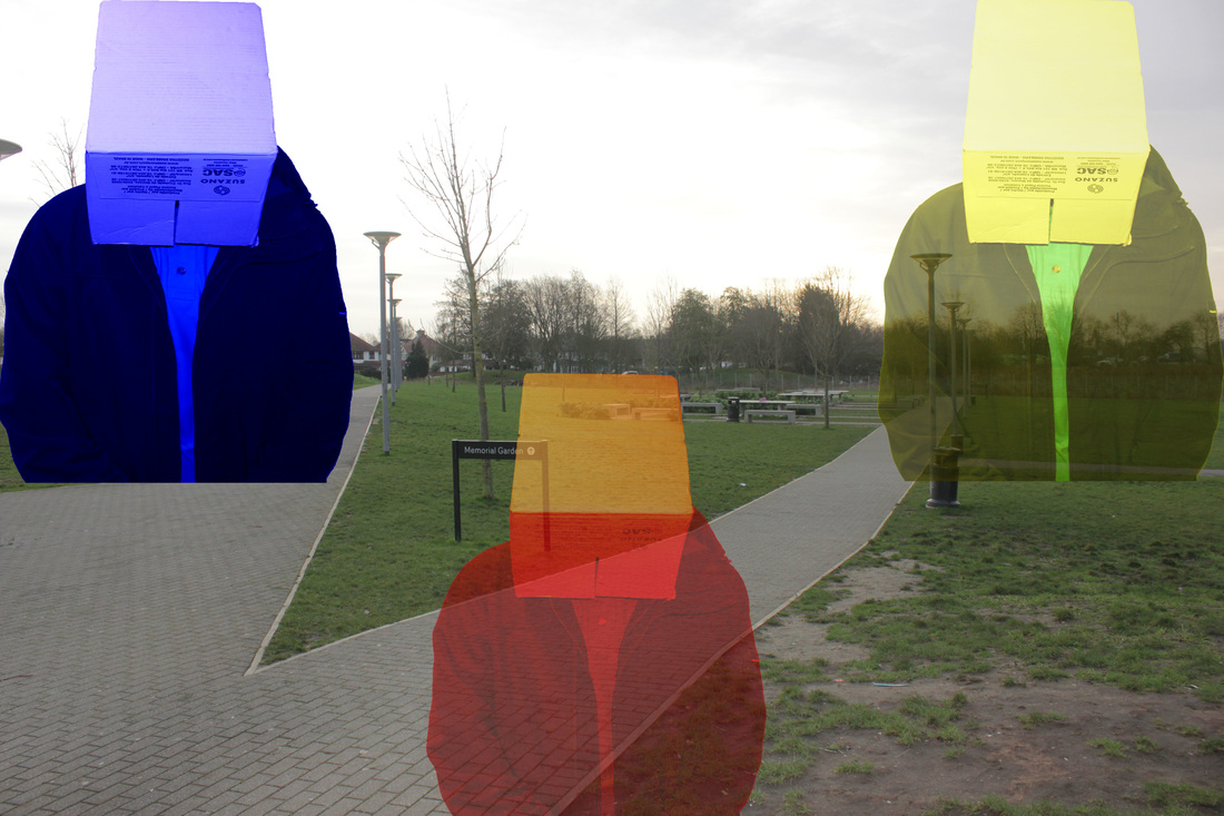
I like this photo because the people in the photo are acting natural in what they are doing but the boxes on their heads make it absurd, also they are positioned in the centre of the photo and they have different levels in hight as well like different postures, the lighting in the photo is lighting from a light bulb.
The whole picture is in focus, i have also edited the photo. If i was going to add on to this image i would add more people with boxes on there heads and have 3 groups of people doing different natural things to make the image more abstract and different things to look at. |
|
|
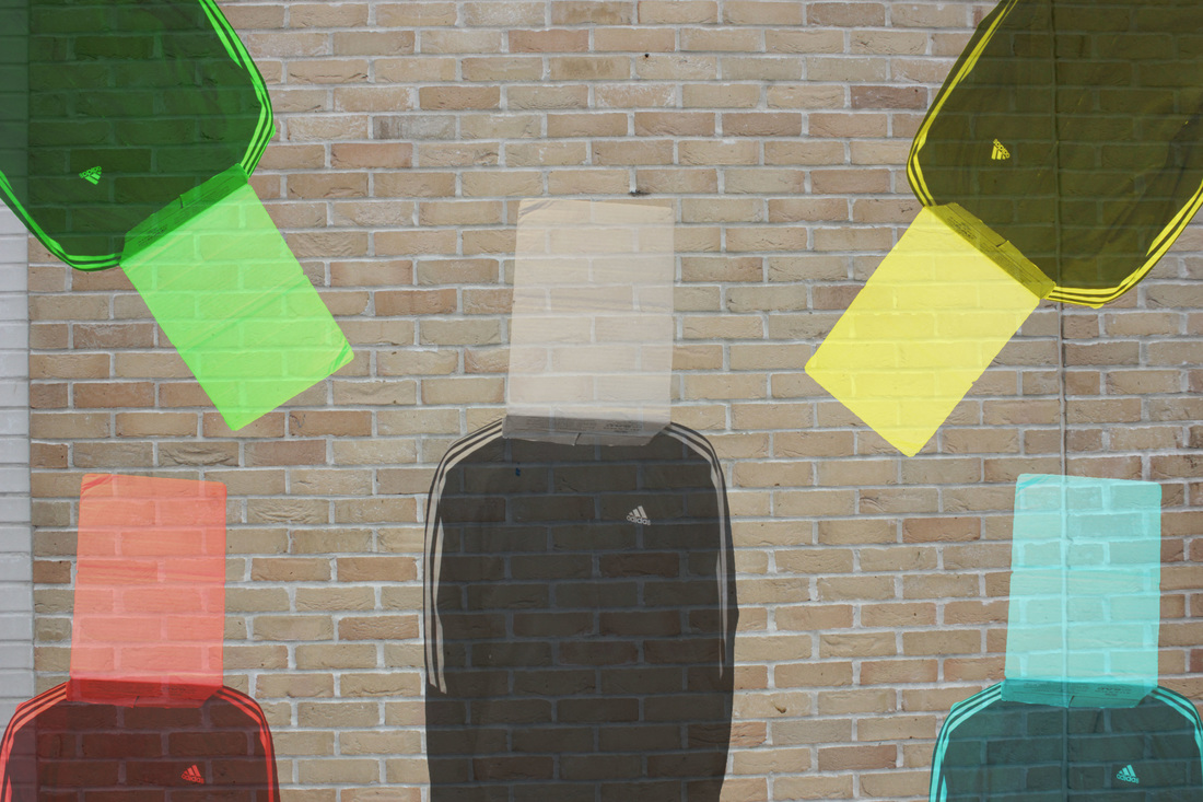
I think these went well because i used a specific pattern and with each portrait of the i put them at a different angle, the lighting in both photos is natural lighting, and each image is my own and is copied and pasted. If i was going to improve these photos i would change the boxes on their heads and just use there faces and think about a better background and maybe
|
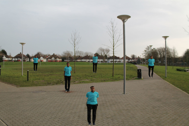
Final piece
too get this idea i had to do a lot of research at first i looked at well known photographers like Erwin Wurm, David Shrigley for some ideas for abstract signs, Michael Hughes for forced perspective all of these photographers helped me to get my first set of experimentation's then i was stuck so i used Pinterest to look up different ideas and thats how i got the idea of hide. Then after my first set of images i looked at Pinterest again and saw what i could improve and add to the photo to make the photo more absurd and unique it worked well because i looked at different photos and looked at mine and i saw what i could improve. the steps i used to get my final piece, was i went outside and took a photo of a boy standing on a drain and by using the quick magic tool i copied his body and pasted it all around the image to get the duplicating effect, i also had to rub out the background of the boy to make him look like there was lots of him scattered around the photo. the lighting in the photo is natural lighting, i think the composition worked well and the background worked well to fit in with the photos. If i was going to improve this photo i would work on my photoshop skills and maybe add a extra effect and i would try and take a photo of different scenery, also getting different abstract poses from the boy.
